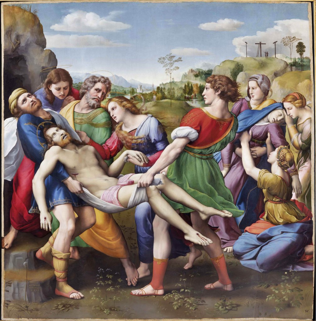
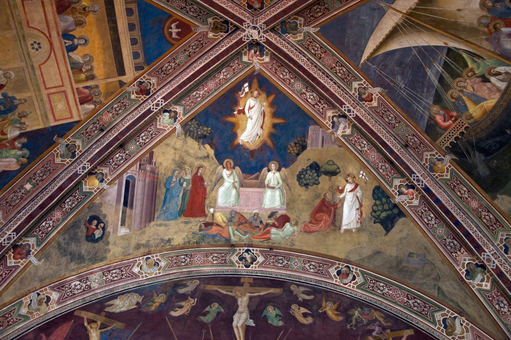
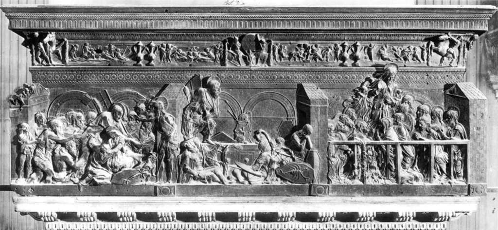
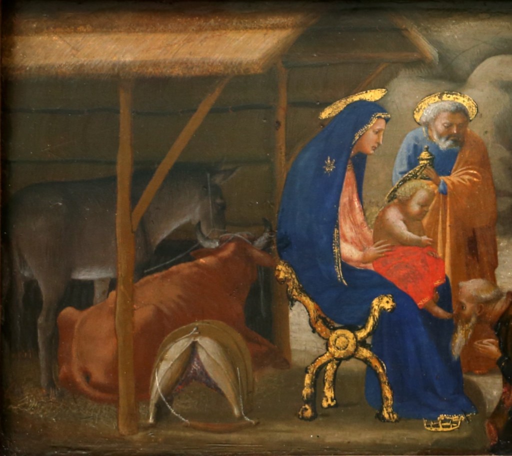
Amanzio Cattaneo, Parmigianino surprised by landsknechts in his studio, 1854. Galleria Nazionale di Parma.
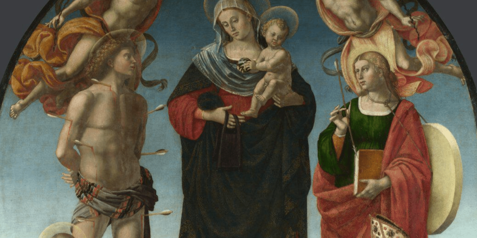
I am reaching the end of my series of talks examining all aspects of The National Gallery’s The Vision of Saint Jerome, and will conclude with a talk about The Sack of Rome this Monday, 3 February at 6pm. To tie in with this I want to look at a painting which has been used to illustrate the most dramatic moment in the painting’s history, when its completion was interrupted by German soldiers who broke into Parmigianino’s workshop in 1527. The talk will be subtitled Politics and Painting – and will cover both of those topics in precisely that order: what were the politics of the day which led to this devastating event, and how did it affect the history and art of Western Europe? As this concludes my Renaissance series – a re-birth for the new year – a new series will follow. I will take a step back to the middle ages, and revel in the unparalleled art of Siena in the fourteenth century, celebrating the National Gallery’s much-heralded exhibition: Siena: The Rise of Painting, which opens on 8 March. I will give individual talks dedicated to Duccio (10 February), Pietro Lorenzetti, Simone Martini, and Ambrogio Lorenzetti, and then bring these all together with an introduction to the exhibition as a whole, including the wonderful art and artefacts by other artists which will also be on show. I will post the dates as and when they are settled. Of course, you can always check on the diary…

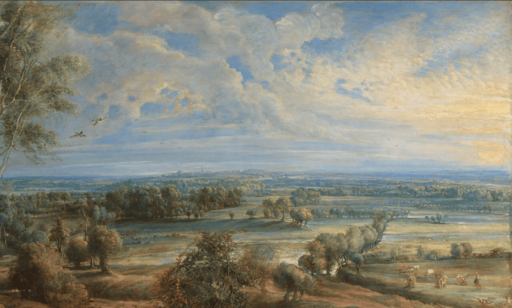
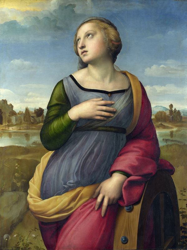
Back to today – or rather, the middle of the 19th century, which is when Cattaneo painted his typically romanticizing view of Vasari’s account of the events of 1527. We can see the artist himself seated in front of his tall, narrow painting. Girolamo Francesco Maria Mazzola (1503-40) became known as Parmigianino because he was the little artist of the family, the grandson, son, and nephew of a family of artists from Parma. However, Vasari always refers to him as Francesco. In the left foreground a woman in a red skirt and white headscarf holds a baby, and to the right a group of soldiers has entered the room in haste. The leader of the group, in the centre of the painting, holds back the others as they take stock of what they see. Parmigianino, who sits calmly in his chair, looks over his shoulder towards them. On breaking in they seem to have knocked over a stool – a sign, perhaps, of their haste – which has toppled onto a portfolio from which project a few sheets of paper – preparatory drawings, presumably. A curtain divides the main body of the room from what could be an entrance hall or lobby. The curtain is held back by another soldier, and there is more activity in the shadows. How well does this coincide with Vasari’s account?
If you didn’t know, it is possible to find the whole text of Vasari’s Lives of the Most Eminent Painters Sculptors and Artists online. This link will take you to the translation by Gaston de Vere which was published by Macmillan between 1912 and 1914, and specifically to the Life of Francesco Mazzuoli [Parmigiano] – the spelling of his various names has developed over time. Vasari starts this anecdote by telling us that Francesco (Parmigianino) had been commissioned to paint a panel for ‘Madonna Maria Bufalini of Città di Castello’,
But he was prevented from bringing this work to completion by the ruin and sack of Rome in 1527, which was the reason not only that the arts were banished for a time, but also that many craftsmen lost their lives. And Francesco, also, came within a hair’s breadth of losing his, seeing that at the beginning of the sack he was so intent on his work, that, when the soldiers were entering the houses, and some Germans were already in his, he did not move from his painting for all the uproar that they were making; but when they came upon him and saw him working, they were so struck with astonishment at the work, that, like the gentlemen that they must have been, they let him go on.
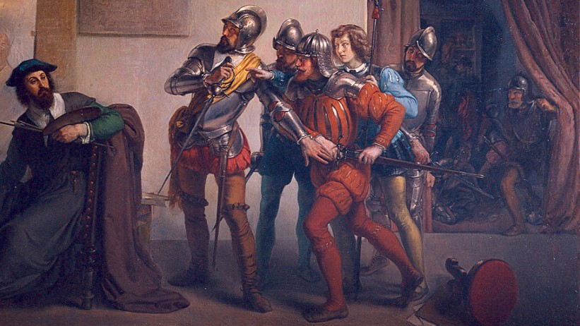
This is exactly what Cattaneo has painted: the artist has not moved from his painting even given ‘all the uproar that they were making’. Although it is shadowy, you can see that there are at least three soldiers in the lobby – one, fully armoured, is crouching down, while others move around, perhaps searching for what they can loot. One figure either wears, or carries, a flowing red fabric, which could be seen as evoking the flames which were engulfing buildings elsewhere in the Eternal City. But that is all just noise in the background. Closer to us, one soldier is pushing back the curtain to enter from the lobby, and five are already present. One, with a helmet, shoulder pauldrons, and a breast plate covered by a slashed red doublet, is being held back by the man on the left of the group. This less impulsive man wears the same armour, but with a yellow sash rather than a red doublet, which may indicate some kind of authority. He has red breeches, and mustard- or buff-coloured hose. His sword is held up in his right hand in front of his chest – an almost involuntary gesture of surprise – while his left hand is extended to hold back the energetic man in red. The colour is telling – not only is the doublet red, but so are the breeches and hose. This is the colour of danger, impetuous anger, and blood. He reaches to draw his sword with his right hand, while his left holds onto its scabbard. My feeling is that it is he who has knocked over the stool, which lies with its red top towards us: the two are linked together by colour. Two more men wear helmets. One, in full armour, stands at the far right, wielding his sword low in his right hand as if to swing it, while another peers through the gap between the leader and the man in red. The fifth member of this group is little more than a boy, with a full head of hair, no beard, and no armour – although he does hold a pike in his left hand. He reaches through the gap between the two foremost men as if to touch the painting – or, maybe, to take the leader’s sword. It looks as if Parmigianino has only just realised they are there, so intent was he on his painting. He turns round and rests his left arm on the back of his chair, holding his palette, brushes, and a mahlstick in his left hand. His sleeve is green – notably, the complementary contrast to the red worn by the soldiers, so potentially illustrating that they have opposing views. The artist seems barely perturbed that these soldiers are there. They are called ‘landsknechts’ in the title – so what was a ‘landsknecht’?

This is an etching by Daniel Hopfer from the Art Institute of Chicago. Made around 1530 – three years after the Sack of Rome – it shows a group of Landsknechte. If anything, their dress is more outlandish that that painted by Cattaneo, although the puffing and slashing of the sleeves and breeches, and the double tying of the same, clearly has the same origin. The meaning of the word is confused by the ways it changed over time: it originally meant ‘servants of the land’ – they ‘served’ the land by fighting for it. But as pikes were one of their main weapons, it was sometimes written as ‘Lanzknechte’ – as in ‘lance’. Whichever way you interpret their name, practically speaking they were well-trained, well-armed and experienced mercenary soldiers, and the main force behind the Holy Roman Empire. If you know the Loggia dei Lanzi in Florence – right next to the Palazzo Vecchio – it took its current name from them: in the middle of the 16th Century Cosimo I had his German mercenaries stationed there. Their outlandish clothing was a ploy – apparently it was meant to strike fear into the hearts of their opponents!
So far, so good – Amanzio Cattaneo seems to have painted a convincing illustration of Vasari’s anecdote – which he could have heard first hand. Both Vasari and Parmigianino ended up in Bologna in 1530 (we’ll see why on Monday), and it seems likely that this account came straight from the horse’s mouth – along with everything else that Vasari wrote about ‘Francesco’. I must confess, though, I don’t know what interested Cattaneo in the story. He was born near Milan in 1828, and studied at the Accademia di Brera under Francesco Hayez. One Italian website implies that his work was made up of ‘historical subjects of a romantic stamp,’ and this painting certainly fits that description. However, that’s about as far as it goes – apart from the fact that he died in Genzano, about 30km southeast of Rome, in 1897. There is nothing else about him or his paintings on the internet – but he seems to have had no direct connection to Parma, or to Parmigianino. What is entirely clear, though, is that he had not seen Parmigianino’s painting.
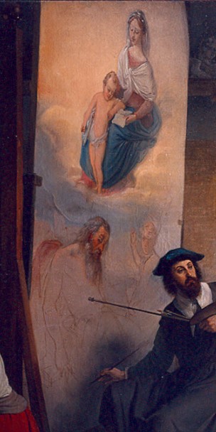

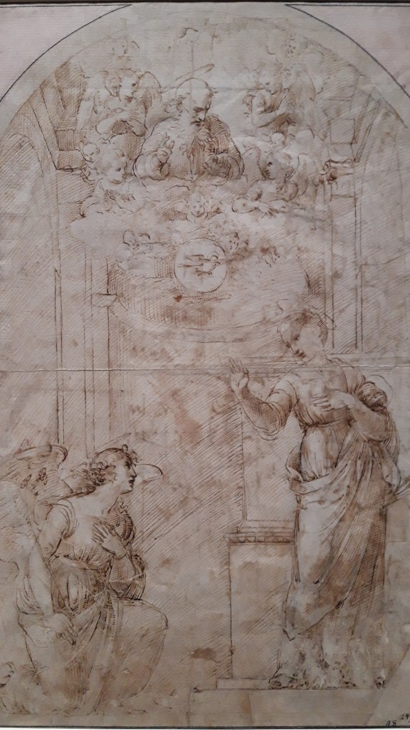
Comparing his depiction of the work in progress with the painting itself, we can see that he has put the Virgin and Child at the top, with Jesus standing at Mary’s feet, and that there is a golden glow around the Virgin. However, it is she who holds the book – on her left knee – rather than Jesus (who rests it on her right), and the boy does not kick out one of his feet. At the bottom the two Saints are the wrong way round, but it’s not as if he’s been looking at a print, which would reverse the imagery. Both heads are at the same level and, even if Jerome has nodded off, with his head falling forward, he is certainly not lying down. While John the Baptist looks towards us and points up with his right hand, this is not Parmigianino’s elaborate invention. It’s not even as if we can blame Vasari’s description of the painting. When writing about the panel for ‘Madonna Maria Bufalini’ he says:
Francesco painted in it a Madonna in the sky, who is reading and has the Child between her knees, and on the earth he made a figure of S. John, kneeling on one knee in an attitude of extraordinary beauty, turning his body, and pointing to the Infant Christ; and lying asleep on the ground, in foreshortening, is a S. Jerome in Penitence.
What Cattaneo has painted is fine, and arguably a good interpretation of Vasari’s description – until it gets to Saint Jerome. Even if he is sleeping, there is no way the saint could be described as ‘lying asleep on the ground, in foreshortening’ – but, if you think about it, Parmigianino’s conception of St Jerome such an extraordinary idea that you really would have to see it to know what it looked like. And it certainly isn’t a ‘S. Jerome in Penitence’ as Vasari suggests. Cattaneo probably wanted to make sure that we could see the figure, and even identify him, given the red fabric propped up somehow behind him. However, aspects of the painting are right, even if not mentioned by Vasari: the golden glow surrounding the Virgin, and the clouds with which she is surrounded, for example. It is almost as if Cattaneo has read another description in addition to Vasari’s.
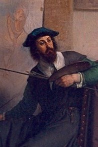
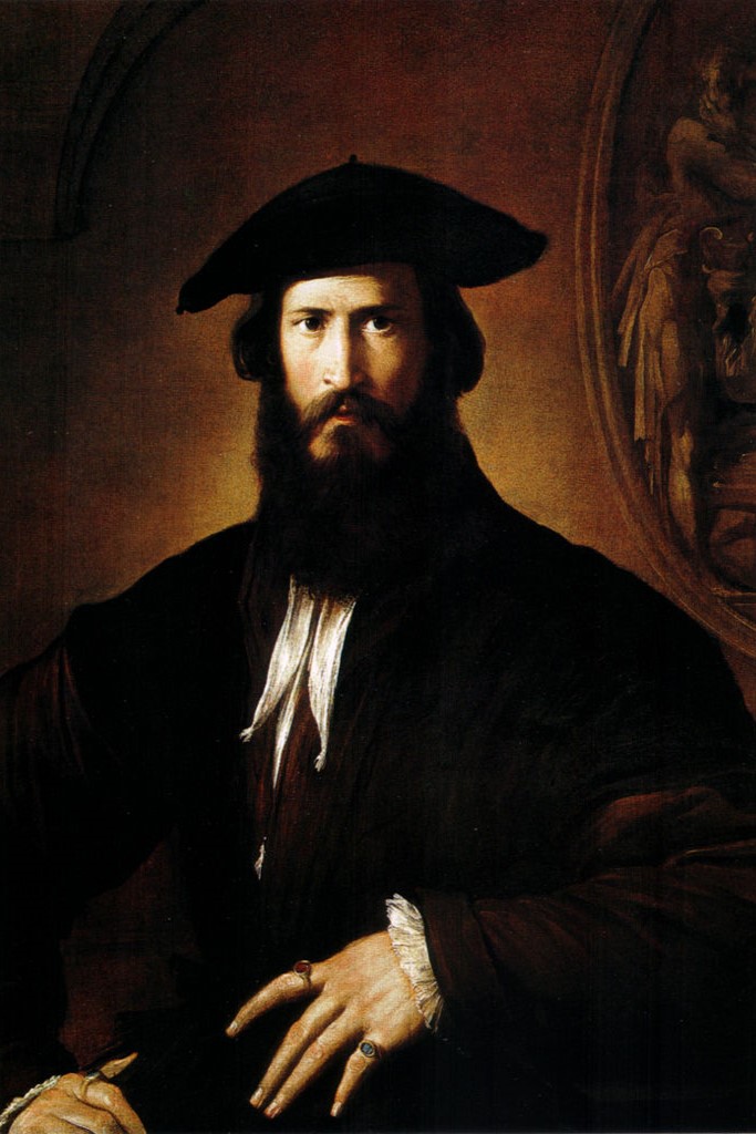
He does seem to have made a very specific choice about how he should represent Parmigianino himself. Cattaneo’s depiction of the artist looks remarkably like Parmigianino’s ‘Portrait of a Young Man’, which was acquired by the Uffizi in 1682. At the time it was identified as a self portrait, with the same identification appearing in print until 1773 at least. However, this idea has never really gone from the popular imagination, and it seems fair to suggest that Cattaneo held on to the traditional interpretation – with a slight trim to the beard, and a larger white collar to make the face stand out. Elsewhere, however, his romanticizing view of an artist’s practice in the 16th century is a little anachronistic.


Cattaneo implies that Parmigianino has painted the Virgin and Child from life models dressed in appropriate costume. The woman on the left wears a white headdress and blouse and a red skirt. Behind her, on the box or stool she is sitting on, is a mass of blue fabric. These colours are precisely those of the Virgin Mary in the painting on which the fictional Parmigianino is working. The model leans protectively towards a small child – a toddler – looking over her shoulder to keep an eye on the intruders and thus keep the baby safe. This little being looks helplessly over its right shoulder – not unlike the child looking over his left in Raphael’s Madonna della Seggiola. However, even in the 1520s it seems to have been remarkably rare for there to be female models – even if fully dressed – and it was even less likely that they would have been dressed in costume and posed with props (e.g. children) in the way that Cattaneo has suggested. This is far more redolent of 19th century practice, which serves as an important reminder that each painting is the product of its time. While the 19th century loved to romanticize the past, Parmigianino’s Vision of Saint Jerome really was created in the fervid period leading up to the Sack of Rome. But precisely why that happened, what happened, and what its consequences were will have to wait until Monday…