216 – Between Earth and Heaven

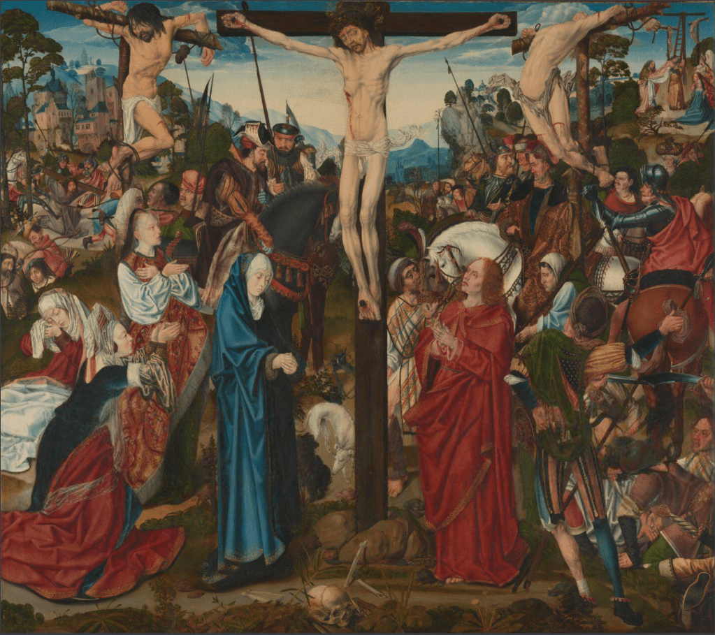
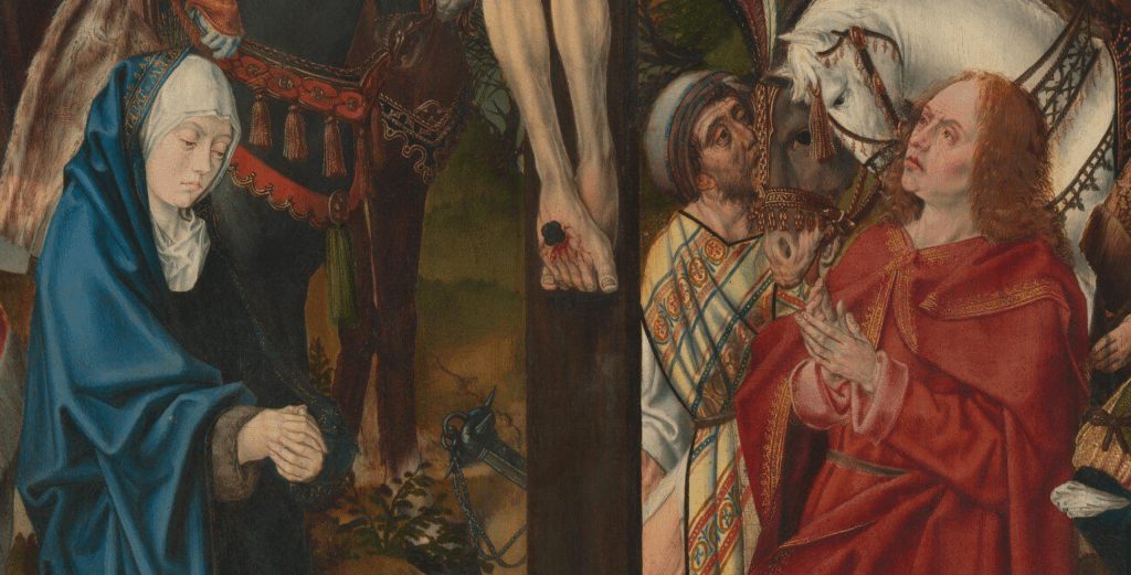
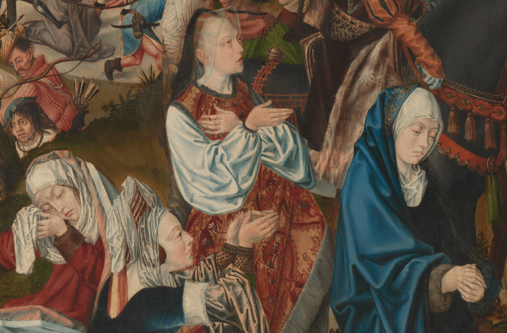
The Master of the Aachen Altarpiece, The Crucifixion, about 1490-5. The National Gallery, London.

I’m really enjoying getting to know the Walker Art Gallery in Liverpool – it has a fantastic collection, with some real gems – and am looking forward to starting my online stroll around the museum this Monday, 12 February with a talk entitled Renaissance Rediscovered. This name is derived from the gallery’s own title for the refurbishment of the rooms housing the earlier parts of their collection. One of the things we will consider is how appropriate it is, particularly as I will start with works from the 13th and 14th centuries, which would be counted as medieval, rather than renaissance, according to most accounts. We will look in detail at the most significant paintings, while also discussing the value of works which in other situations we might overlook. This exploration will continue the following week with The High Renaissance, or, to be more precise, with works from the 16th Century. I will then take a break from the Walker to visit the Birmingham Museum and Art Gallery, and their exhibition Victorian Radicals (the Pre-Raphaelites and the Arts and Crafts Movement, 26 February) before heading down to London, and Tate Britain, for Sargent and Fashion (4 March).

I wasn’t sure which of the Walker’s many treasures to write about today, and then realised that one of the paintings is actually on loan from the National Gallery: it’s the central panel of a triptych of which the Walker owns the wings. It makes sense to look at it in detail today, as this will allow me to spend more time on the wings on Monday. Another reason for writing about this particular image is that Lent starts on Wednesday (yes, it’s Shrove Tuesday, or Carnival, next week). Three years ago, in 2021, we were in lockdown, which meant I had the time to write a post every day during Lent. Each post looked at a single detail of a single painting, thus gradually building up a fuller understanding of it – without initially knowing what that painting was. As it happens, it was in many ways similar to today’s example. You can start following that, if you feel like it, by clicking on the word Lent

This is not the prettiest painting. Indeed, it is one of the more grotesque works that I’ve written about, but art is not only about beauty, it is also about truth: the grotesque elements of this image say a lot about the cruelty of the acts performed over Easter, and speak to the suffering of Jesus. This is not Charles Wesley’s ‘Gentle Jesus, Meek and Mild’, even if he does appear remarkably at peace, despite everything. The cross on which he is crucified is planted in the centre of the painting, his figure placed frontally towards us. His mother, the Virgin Mary, and apostle, St John the Evangelist, stand at the foot of the cross in what, by the time this was painted, had long been their traditional places. Mary is on our left and John, our right, under Jesus’s right and left hands respectively. There is more space around these three main figures than anywhere else, and their pure bold colours – blue for Mary, red for John, and pale, naked flesh for Jesus – make them stand out from the crowd. They are isolated in the midst of what is otherwise a riot of forms in movement, of rich, patterned colours, and bold emotions. There is almost too much to look at.

You could argue that Jesus’s unique being – both fully God and fully human, two natures in one being – is expressed by the placement of his body. Above the waist his background is the sky, the ‘home’ of his Father in Heaven. Behind his legs we see the earth, and the impinging human figures. His loin cloth flutters above the horizon like a low flying cloud, the tonal values close to those of the distant mountains, rendered pale by the aerial perspective. He is framed by the sky, the open space around him allowing him to be seen more clearly than anyone else, and isolating him from the noise and activity with which the painting is otherwise filled. This space is created by the valley sloping down between the hills to the left and right, the line of the horizon echoing the curve of his arms. The hills on either side also connect the two thieves to the world with which they were so nefariously involved. They are traditionally disposed, with the Good Thief at Christ’s right hand, and the Bad at his left. Even if they do not have the ‘signifiers’ which in other paintings can help to identify them, there are subtle differences in the way they are depicted which confirm that the hierarchy of ‘right’ and ‘left’ – from Jesus’s point of view – is enough to tell us which is which.

It is better to be at the right hand of God, particularly as regards the Last Judgement (the damned will be on his left), and although the Virgin and Evangelist are both assured of their salvation (well, Mary has no sin, so does not need to be ‘saved’), her placement on Christ’s right tells us that her status is higher than that of John, however close to Christ he might be. Both their verticality, parallel to the cross, and their location directly under right and left hands, tie them to the figure of Christ. Otherwise, the ‘good’ and the ‘bad’ are in their respective places. Mary, at Christ’s right, is flanked by three holy women, all of whom were also called Mary. In the left foreground the diagonal formed by the kneeling woman continues through the fur hem of her standing companion, this diagonal leading our attention towards Jesus on the cross. John, at Jesus’s left, is surrounded by reprobates: soldiers, and others bent on Christ’s destruction. Although this side is more disordered, there is also a more subtle diagonal, formed by the hilt of the sword, and the back of the crouching man who wears it right in the bottom corner (this will be clearer in a detail below). The standing soldier, whose right arm holds onto an angled spear in an exaggerated gesture typical of the Master of the Aachen Altarpiece, also acts as a repoussoir: with his back to us he is looking into the painting, which encourages us to do the same.

John’s upward gaze also encourages us to look towards Jesus. His eyes are red with sorrow, his hands uncertain, at a loss what to do. Mary looks down, her grief contained, her pale and perfect complexion a reminder that, free of original sin, she will not age: at the very least she must be forty-eight by now (the age she was assumed to have been). You may be able to see the gold decoration of the hem of her cloak as it crosses her white headdress, and if you can, you may just be able to see that it includes an inscription: ‘stabat mater‘. This was the title of a 13th century hymn, and on its own it means ‘the mother was standing’. This only really has its full impact in the context of the phrase as a whole: ‘the sorrowful mother was standing by the cross from which her son was hanging’.

So much of what we see is derived from the bible. In the Gospel According to St John, Chapter 19, verses 25-27 it says,

25 Now there stood by the cross of Jesus his mother, and his mother’s sister, Mary the wife of Cleophas, and Mary Magdalene.
26 When Jesus therefore saw his mother, and the disciple standing by, whom he loved, he saith unto his mother, Woman, behold thy son!
27 Then saith he to the disciple, Behold thy mother! And from that hour that disciple took her unto his own home.

Not only does this explain the presence of the Virgin and St John at the foot of the cross (if not their exact positions), it also gives us the identity of two of the other Maries – the Virgin’s sister (Mary Cleophas) and Mary Magdalene. In Mark 15:40 we read,

There were also women looking on afar off: among whom was Mary Magdalene, and Mary the mother of James the less and of Joses, and Salome.

This ‘Salome’ is completely unrelated to the daughter of Herodias who danced for Herod. The woman we see here is usually called Mary Salome. Like Mary Cleophas (who was identified as ‘the mother of James the less and of Joses’) she was often said to be a stepsister of the Virgin. Together with Mary Magdalene, they are the three Maries who are often seen at the Crucifixion, and later, at Christ’s tomb. Without inscriptions bearing their names it is not always possible to tell which is which, although Mary Magdalene often carries a jar of precious ointment, her main attribute. Here, though, she does not. However, she does stand, giving her a higher status (and making her more prominent, more on a level with the Virgin and St John), and she also wears the most elaborate and expensive clothing. Although Christian myth implied that she renounced her worldly past on meeting Jesus, for artists it was important to retain this display of finery, if only to help us identify her.

Clothing is also significant to define the character of the people surrounding St John. Apart from anything else, there is too much leg on display: the man in the splendidly patterned yellow robe at the left edge of this detail reveals a lot of thigh as his leg extends from his split skirt, while the soldier with his back to us reveals his calf. In neither case would this be deemed appropriate, which tells us that these are not respectable people. Facial features are also telling: the distorted, wrinkled, and scarred faces were thought to reveal the inner person, as ugly on the inside as they are without. The inelegant postures do the same. In this regard, the confusion at bottom right deserves closer attention.

In the foreground we can see something I haven’t seen before. In paintings like this, it is not uncommon for the cruel, even evil, to be mocked, and often it is as if the slovenly soldiers have allowed their ‘trousers’ to fall down, thus rendering them ridiculous, and taking away their power. Here, however, the man appears to have rolled up his ‘trouser leg’. His right calf is clad snugly in blue hose, a straight seam running from behind the knee down to his heel. However, the equivalent left leg of the hose has been peeled off, it seems, and the lower end pinned up to his waist. However, it is still attached to the red and black striped sections, decorated with a pattern of a gold knotted chord, with cover his thighs. We can see that his calf is ridged with varicose veins, and his ankle or shin is bandaged – which might explain why he has looped up his hose. Whatever the precise implication of this injury, there is surely a lack of decorum here, someone who is not dressed respectably, and so someone we need not respect. The same is true of the man crouching on the ground to the right. He is actually kneeling, with one foot crossed over the other. He bears his weight on his bent left arm, the gold-lined sleeve rolled up to reveal a black undersleeve, and in his right hand he holds a pair of dice. His companion, a particularly gormless looking man in a striped tabard, pulls at a black mop of hair belonging to a third man, who is bending over towards us, on one knee, with the more upright leg visible and clad in red hose. It’s a complex arrangement of figures which is hard to read, but they are the men mentioned in Matthew 27:35 –

And they crucified him, and parted his garments, casting lots.

These men are a fulfilment of Psalm 22:18 –

They part my garments among them, and cast lots upon my vesture.

Above them, at the top of the painting, we see the Bad Thief, in the most remarkable, contorted pose. This extreme stretch, with body arched and taut, and arms and legs twisted, confirms his identity, and reflects the convoluted wickedness of his soul. The flesh pulls against musculature and ribs, and we cannot see his face, just glimpsing the underside of his chin, his nostrils and a hint of an eye. The jagged, discoloured loin cloth adds to the sense of unpleasantness, even discomfort. This pose is echoed in the background as part of the next episode in the story: Jesus is taken down from the cross by Nicodemus and Joseph of Arimathea, while John supports the Virgin – who has collapsed to the floor in her grief – and two of the Maries look on.  The pose of the Good Thief here is also an echo of the main image.

His body is also contorted, with the arms and legs wrapped in different directions around the cross. However, I can’t help thinking that he looks more tranquil: his body is more relaxed and not wracked with either tension or guilt. On being told by Jesus that they will see each other in Paradise he is assured of his own salvation, and his face appears both rested and serene. Even the loin cloth is an indicator of his serenity – particularly when compared to the jagged energy of the Bad Thief’s greying fabric. His hair is curiously dark (it is usually shown the same light brown as Jesus’s), and oddly long, falling over his face in what seems to me a peculiarly 21st-century way. In the background we see another image of Christ, some way behind the Good Thief’s feet.

This is an earlier episode from the story, the Via Crucis, or ‘Way of the Cross’. Still wearing the purple robe and crown of thorns with which he was dressed in mockery by Pilate’s men, Jesus is carrying the means of his execution on the road to Calvary, the place where he will be crucified. He is still mocked and beaten. A rope is tied around his waist. One end is held by a man in a blue smock with red leggings who leads him forward, the other end by a man in striped blue hose and armour who kicks him as he falls. There are two other soldiers, one of whom prods Jesus with a long stick or spear. The other stretches back his right arm as if preparing to strike.

The two small, additional scenes form a continuous narrative leading from the background on the left (the Via Crucis) to front centre (The Crucifixion), and then to the background again (The Descent from the Cross), almost as if a camera were panning across and zooming in to the most important part of the story. However, the painting was originally more complex than this. As I said at the top, The Crucifixion is currently on loan to the Walker Art Gallery in Liverpool. They own the two side panels of the triptych, and together they help to complete the story. When they were closed, another, less usual narrative could be seen, not only brilliantly painted but also surprising in content: we will look closely at these outer panels on Monday.

In the detail above I said that Jesus was on the road to Calvary, a place name derived from the Latin word calvaria, meaning ‘skull’. It has another name, which is actually the same: ‘Golgotha, that is to say, a place of a skull’, to quote Matthew 27:33. The skull in question can be seen in full view, front and centre at the base of the cross.

In legend this was the skull of Adam, the first man, and the first to die. On his grave was planted a shoot of the tree of life, which was eventually used to make the cross on which Jesus was crucified, the cross being planted in exactly the same place as the tree from which it was hewn. No, none of this is in the bible, but it was widely believed anyway. In the painting it gives the Master of the Aachen Altarpiece an excuse for a glorious still life detail. The skull is expertly depicted, and is flanked by a caterpillar and a frog, neither of which is entirely of the earth. The frog started life as a tadpole, and regularly returns to the water. It is somewhat slimy and not necessarily pleasant, and was often related to death, decay and even the forces of evil (think of the witches in Macbeth, with their ‘eye of newt and toe of frog’). The caterpillar, worm-like, might seem similarly ‘unpleasant’, but at least it will be redeemed: it will ‘die’, and enter a tomb – its cocoon – before emerging as a butterfly, far more beautiful and destined for the sky. This death and resurrection into a superior, heaven-bound form is not only related to the death and resurrection of Christ, but of mankind in general. From being gross, and earthly, we will transcend our mortal remains to become pure spirit: the butterfly was a symbol of the human soul. In Ancient Greek ‘butterfly’ and ‘soul’ were even the same word: psyche.

On either side of the skull are beautifully naturalistic renderings of different plants. From left to right they are – with different degrees of certainty – common knotgrass (Polygonum aviculare), prickly sow-thistle (Sonchus asper), oleander (Nerium oleander), maidenhair spleenwort (Asplenium trichomanes) and plantain (Plantago major). There’s a nice dandelion further to the right of this detail, too. Whatever the symbolism (and it varies, from the results of sin to the possibility of salvation), the Ecologist reliably informs me that they are all – with the exception of the more Mediterranean oleander – plants that grow in settings which have been disturbed by humans. This very specific ecosystem has no symbolic value, nor would the concept have been understood by the artist. Nevertheless, it is an example of superb observational skill, and an embodiment of the interest in the world around us which was an essential element of renaissance thought. You could argue that the observation of the humans in the painting is not of the same order – but how ‘human’ are they? The heightened depiction of their grotesque behaviour is, perhaps, an accurate rendition of their inhumanity. The outer wings of the triptych constitute similarly astute observations of church practices of the day – but we will have to wait until Monday to think about that.

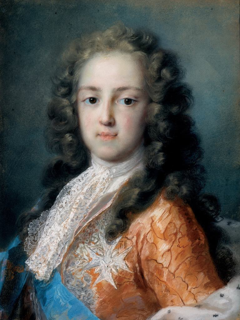
Back to the King.

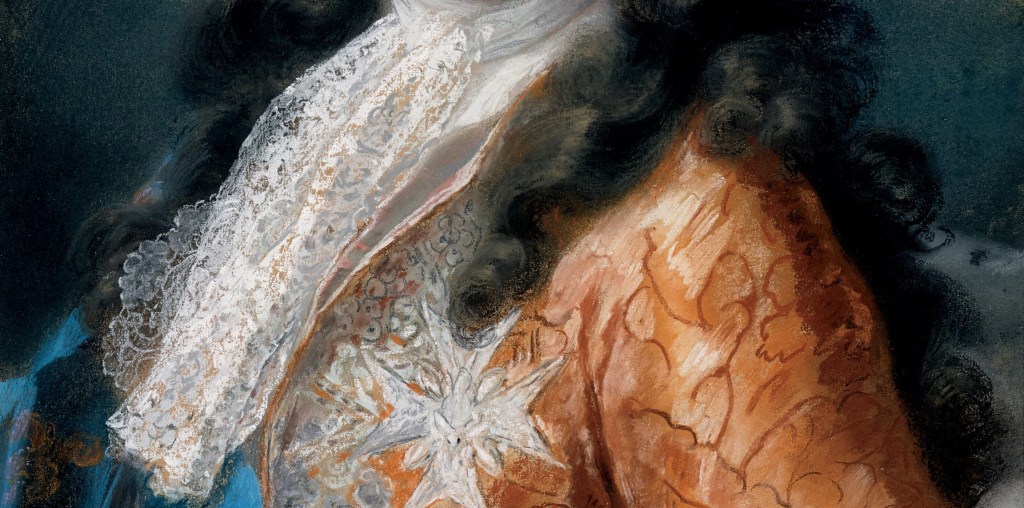
Rosalba Carriera, King Louis XV of France, 1720-21. Gemäldegalerie Alte Meister, Dresden.

This Monday, 5 February at 6pm I will be introducing one of the National Gallery’s fabulous, focussed, and free exhibitions, the second in their Discover series, with a talk I am calling Discovering Liotard. However, as I am in London this week delivering a number of In Person Tours (see below for the next set!), I haven’t had a chance to write a post specifically about Jean-Etienne Liotard. This is a real pity, as he was a remarkable artist with the most brilliant technique. The range of textures he could replicate with the often-matte medium of pastel is remarkable, and it is such a revelation to see his great masterpiece, The Lavergne Family Breakfast, compared with its equivalent in oils – but as I will do that during the talk there is, perhaps, no need for a blog. Instead, I would like to revisit a post from last year about another great pastellist, Rosalba Carriera, the woman who, you could argue, single-handedly popularised the medium. The following week (12 February) I will start my Stroll around the Walker – an occasional series looking at my new ‘local’ art gallery in Liverpool. This first talk will introduce the earlier part of their new hang, Renaissance Rediscovered. I have a couple of exhibitions to see this week, but it may be that the second of these Strolls will follow the week after – I’ll know more about that by Monday: do keep your eye on the diary. However, I already know that the In Person Tours will continue in March (the next time I’ll be in London with time on my hands!). I will repeat NG02 The Early Renaissance (in Florence) for one last time on Thursday 14 March at 11:00am, and will also repeat NG03 The Northern Renaissance twice, on Wednesday 13 March at 11:00 am and Wednesday 13 March at 2.30pm. There will also be a new tour, NG04 Florence: The Next Generation, looking at mid-century Florentine artists, including Fra Angelico and Fra Filippo Lippi. That will also take place twice, on Tuesday 12 March at 11:00am and Tuesday 12 March at 2:30pm. But let’s have a look at one of my favourite pastels first!

It is a bust-length portrait of King Louis XV, who must have been ten when it was painted (see below). He had succeeded his great grandfather Louis XIV five years earlier, and, until he reached his majority (at the age of 13) in 1723, his great-uncle, Philippe II, Duke of Orléans, was regent. The painting is often listed as Louis XV as Dauphin, which is odd, as he was Dauphin (heir to the throne, the French equivalent of the Prince of Wales) from the age of two until he became King at five. He is clearly older than that here. The Gemäldegalerie Alte Meister (‘Painting Gallery of Old Masters’) in Dresden, which has the best collection of Carriera’s work, and to which this painting belongs, correctly calls him King. I say ‘painting’ advisedly, as pastels have always, traditionally, been called paintings, even if they are done with crayons rather than brushes. My primary school training (painting is with brushes, drawing with pencils and crayons) fights against it, but there you go. Pastels are, like paint, a pigment supported in a medium. The pigments are the same, but for pastels the medium is gum arabic (or an equivalent), mixed with a ‘filler’, often kaolin (a type of clay). The medium supports and protects the pigment, as well as fixing it to the support, just as it does in a paint, and the technique is used, as it is with a paint, to colour broad areas of the support – which, for pastels, is a thick, prepared paper. Rosalba Carriera was the early master of the developing medium – and Liotard was one of her great successors, as we shall see on Monday.

Her control of the technique was second to none, and you can see that here in the subtle variation of tones across the King’s face, which models the form in three dimensions while not making it too solid and sculptural. It is possible to blend different coloured pastels together, either with the fingers or rolls of paper (a process known as ‘stumping’), but you cannot mix them freely on the surface as you can with oils. This means that, if you want a greater degree of subtlety, you need a large number of different crayons covering the whole range of hues and tones (colours and shades). As well as her subtlety of tone, Carriera was also remarkably adept at suggesting that you can see things which aren’t actually there – the hair for example. The locks on the right of the image were built up on a very deep brown, which is just shading – there is nothing especially ‘hair-like’ about it: it’s almost plain, unmodulated black. But then the swift strokes of auburn on top of it, tipped with touches of butterscotch, give it all the lustre of youth and build it up into vibrant curls. All of this encourages the mind’s eye to fill in details for the almost black shadows which, in reality, have no detail. The King’s eyes are given catchlights with the smallest dab of a white crayon, and the mind expands these to fill the whole surface of the eye, white and all, with a liquid glow. The catchlights also help to focus the eyes on us – or maybe, looking just past us.

The lace of the stock is also a marvel of abbreviation. Using a white crayon again, she would have run the length of it across the surface, creating a white haze, almost like a semi-transparent gauze. Then, using a sharpened end, she would have drawn in a few loops of white around the edges to create the sensation of lace. For the water silk of the sleeve the orange/red base was elaborated with darker red lines, and some of the spaces then filled with freely drawn white lines of different strengths to suggest different intensities of reflected light. Where there is less reflection, the base shows through more.

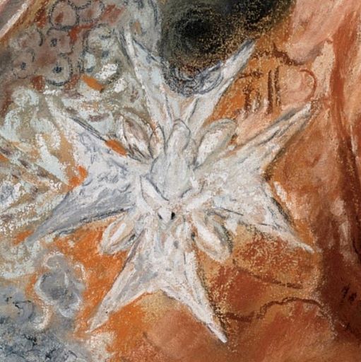
The King’s status is made clear at the bottom of the painting. Wrapped around his back and across his left arm is an ermine-lined cape, telling us that he is King. He is also wearing a light blue ribbon, and a Maltese Cross-shaped badge. These are the accoutrements of the Order of the Holy Spirit, established by Henry III of France in 1578: by this point Henry considered the older Order of St Michael to be somewhat devalued. In French ‘blue ribbon’ is cordon bleu. The order was supposed to have had such lavish banquets that before long the their nickname – ‘Les Cordons Bleus’ – became synonymous with haute cuisine. Well, that’s one theory. The badge shows the Holy Spirit in the form of a dove mounted on the Maltese cross, the details of which are all symbolic (with numbers relating to the gospels and the beatitudes, for example), although Carriera, for probably obvious reasons, shows it only schematically.

Rosalba’s fame had spread from Venice as early as 1700, and she was invited to Paris by some of the leading lights in the arts. Notable among them was Pierre Crozat, a great patron, who is seen as especially important for his promotion of the work of Antoine Watteau (whose portrait Carriera painted). While in France she wrote a fascinating journal made up of regular entries which are, by turns, succinct and intriguing, informative and amusing. This has been transcribed and translated into English by Neil Jeffares, whose exhaustive Dictionary of pastellists before 1800 is (a) the go-to resource for anyone interested in the subject and (b) available for free online. For the Dictionary, click on Dictionary, and for the Journal, click on Journal.

Carriera was in Paris for nearly a year, and she makes many references to her encounters with the King, whether seeing him dine, inspect the troops, or sit for a portrait. For example, on 14 June 1721, she ‘Began the small portrait of the King’. Then six days later, (20 June), ‘Thursday, in heavy rain, went to the King, and began his large portrait’. She went back the next day: ‘I went to the King’s with a terrible headache; then went to the table of the Duke Governor, who took me by the hand, and said: “you must have been nice for the King to be so patient”. It’s hard to imagine. A ten-year old head of state of what was arguably the most powerful nation in the world, sitting still for long enough to have his portrait taken… particularly with everything that might happen (see 25 June). She was back again the next day (22 June): ‘Went with others to the King’s’. It seems to have become almost habitual. My favourite entry, though, is undoubtedly three days later: ‘25. Went with my brother-in-law to finish the King, who suffered three small accidents: his gun was dropped, his parrot died, and his dog fell ill.’ I can’t imagine how the poor little Sun King coped with it all. I’m not sure how Rosalba Carriera coped with it all either: she must have had the patience of a Saint (she does seem to have been quite religious). The ‘brother-in-law’, by the way, was Giovanni Antonio Pellegrini, one of the great men artists of Venice (why does that sound stranger than ‘women artists’?), who had married Rosalba’s sister Angela, and had previously spent a number of years decorating some of the Stately Homes of England.

So far we have mentioned two portraits of the King – one small, one large – but there are others. On ‘First of August, Thursday. I had orders from the King to make a small portrait of him for the Duchesse de Ventadour, and on the same day I began another small portrait also of the King’ and two days later she ‘ordered ivory for the miniature of the King’. Again, on 19 August, ‘Started the small portrait of the King’. There are also references to copies… It’s hard to say which version this is, but it could be one of the four ‘small’ portraits mentioned on 14 June, 1 August (two examples) or 19 August. The last three could be the ones later referred to as copies – it’s hard to tell. Still, they were all made in 1720 so it seems safe to say he was 10. But we can’t be 100% sure.

Overall the portrait has an extraordinary sense of confidence, and even, swagger – for a 10-year-old, whose father and grandfather were both dead by the time he was two. His chest faces to the front left, with his left shoulder towards the front right, thus defining two diagonals going back in space. He turns his head to look out towards us, even if he doesn’t appear to be entirely focussed on us. Affairs of state weighing on his young shoulders, perhaps. Or a dead parrot. His stock traces a diagonal from top right to lower left, and is paralleled, however briefly, by the ermine at the bottom right corner. The blue ribbon echoes this on the opposing diagonal, the lines of both stock and ribbon also being echoed by the locks of hair falling over both shoulders. These short, overlapping diagonals, the tumbling curls of the hair, the delicacy of handling and the delicacy of colour are all features which alert us to Carriera’s importance for the development of the Rococo. I think it’s a fantastic portrait, and I am lucky enough to have seen it in the flesh three or four times now (some of you might even have been there). On Monday, though, I will be talking about one of the great men pastellists – Jean-Etienne Liotard: I do hope you can join me!

215 – Pesellino, the King, and the Kaiser

Francesco Pesellino, Saints Mamas and James, about 1455-60. Royal Collection Trust/His Majesty King Charles III.

To introduce my next talk, which is about the National Gallery’s jewel of an exhibition Pesellino: A Renaissance Master Revealed (this Monday, 29 January at 6pm), I would like to talk about a painting which is part of the Royal Collection, which, as a whole, is held in trust for the nation by the King. We’ll get to that soon. The next talk, a week later, will cover the Gallery’s other wonderfully focussed – and free – exhibition, Discover: Liotard and The Lavergne Family Breakfast. After this I will start an exploration of the Walker Art Gallery in Liverpool, my new ‘local’. The talk will celebrate their beautiful refurbishment and rehang, which they have called (whether accurately or not) Renaissance Rediscovered. It will be the first in an occasional series about the gallery which I am calling A Stroll around the Walker. In the real world (rather than online), I’ll be in London next week for some more in-person tours of the National Gallery, and there are still one or two places available for each of the visits - if you’re free. In terms of chronology, if not actual dates, the first will be NG01 – The Early Italians, on Thursday 1 February at 11:00am, looking at work from the 13th and 14th Centuries. However, if you want to jump forward to the 15th Century, then NG02 – The Early Renaissance (in Florence), will take place twice on Wednesday 31 January at 11am and Wednesday 31 January at 2.30pm. The day before I will also deliver NG03 – The Northern Renaissance, starting (I hope!) with The Arnolfini Portrait. Again there will be two talks, on Tuesday 30 January at 11am and Tuesday 30 January at 2.30pm. Details of all of the above are in the diary, of course, together with information about my trips abroad with Artemisia, which are rapidly filling.

At first glance today’s painting seems simple enough – two standing saints (we know they are saints because both have halos). Closer to us, and on our left, is a young man, or even boy (and yes, it is a boy: remember that miniskirts for women weren’t invented until the 1960s – and his hair isn’t dressed, or covered, as it would be for any respectable woman at the time this was painted). He stands with his weight on his left leg, his right extended behind him, with one hand on his hip. He wears a very short blue tunic and a long olive-green cloak, thrown back over his right shoulder to reveal a golden yellow lining. To our right an older man – he has longer hair and a beard – stands with both feet more firmly on the ground. He wears an ankle length red robe, and an equally long red cloak – they are not easy to distinguish. He holds a staff in his left hand and a book in his right. Lions lurk on the left of the painting, one just nuzzling its way around the boy’s cloak. The most unusual thing about this painting – catalogued on the Royal Collection website as RCIN 407613, described as measuring 140.5 x 58.5 x 3.4 cm (the last measurement being the thickness of the panel), and painted in oil on poplar wood – is its shape: almost rectangular, but with the top right hand corner cut away. This partly explains the full title given on the website: Saints Mamas and James (A fragment).

The painting of the faces is both delicate and refined, with subtle outlines defining the most important forms, and an understated modelling of the features: the corners of the saints’ mouths, their eye sockets, foreheads, and necks – and also the dimple in the boy’s chin. The older saint’s staff has two rings carved around the shaft. The lower one can be seen in this detail, level with his cheek, and above his beautifully (and accurately) articulated left hand. This is a pilgrim’s staff, which serves to identify the owner as St James Major, the older of the two apostles called James. His shrine, in Santiago di Compostela (where Sant Iago – St James – is believed to be buried) is the destination of one of Europe’s greatest pilgrimages. The missing corner of the painting is very much in evidence here, as is a stray piece of what might appear to be green drapery running along the diagonal.

The fabric continues around the oblique corner of the ‘fragment’. Next to it we see the sky, a negative space which, compositionally at least, suggests that the fabric is related to the figure of St James, following as it does the fall of the cloak which is hanging from the Saint’s left arm. Towards the bottom of this detail there is also some red drapery – but what either green or red represent cannot be deciphered from this little evidence.

All four of the hands in this detail are superbly painted, and all are articulated in different ways, holding, clasping, or resting. They line up along a loose, low diagonal, leading our eyes towards the impinging green drapery. St James’s right hand holds a book with a dark turquoise cover, delicately painted clasps, and shiny metal studs (at least they are shiny, or reflective, when they are in the light). The boy holds a leaf in his left hand. It represents a palm of martyrdom, which tells us that he was killed as a result of his faith, even if it doesn’t tell us which martyr he is. His right hand rests against his hip, with the palm turned out. It holds up the cloak just next to a clearly delineated belt, gold with red dots. His right elbow projects towards us, pushing into our space, and revealing the hem of the sleeve which runs along the arm and stretches around the point of the elbow.

Like the hands, the feet direct us from left to right, with the exception, perhaps, of the boy’s right foot, which points to the bottom left corner. However, his left is ‘in profile’, pointing to our right, in parallel with St James’s left foot. The older saint’s right foot is at a slight diagonal, giving a sense that he is more fully turned to our right than the boy, and almost implying that the boy’s right foot will also turn in this direction. St James’s feet are unshod, whereas his companion wears curious calf-length, animal skin sandals, with heels and toes uncovered – an attempt, presumably, to create some form of archaic footwear.  Pesellino seems to enjoy the interplay of the colours in the drapery, with the looping of the gilded hem of the short blue tunic, the waving alternation of gold and green along the hem of the cloak, and the counterpoint between the boy’s pale legs, and the shadowed, columnar folds of the orange lining. The lions appear all but incidental, although one seems to be attempting to edge its way into the painting, while a second looks up towards the boy. A third remains all but hidden, its muzzle appearing behind and below that of the first. They tell us – if we know the story – that the boy is St Mamas. Never heard of him? Don’t worry, this is possibly the only painting in which he appears, and we only know who he is thanks to some remarkable surviving documentation (more about that on Monday).

St Mamas’s pose might have struck you as familiar – particularly if you are a fan of of Donatello. It is the reverse of his enigmatic bronze David, with which it shares the hand on hip, and exaggerated contrapposto – the classical pose with one weight-bearing leg straight and the other bent. Pesellino has, admittedly, relaxed the bent leg, and drawn it back behind the other, and has changed the position of the other hand, but otherwise the borrowing is unmistakable: even the peep-toe sandals derive from this precedent, even if the material from which they are made is different. This quotation tells us two things: first, that Pesellino had been in Florence (which, to be honest, we knew anyway) and second, that Donatello’s sculpture must pre-date 1457, the year in which Pesellino died. This is useful, as the bronze has been notoriously difficult to date (current theories suggest ‘1435-40 – or later’ - on the V&A’s website – or ‘c. 1440’ according to the Florentine institution which owns it, the Bargello).

There are so many different aspects to ‘The History of Art’ – which, as I have been discussing recently, should really be ‘the Histories of Art’ – and one of them is the history of collecting. I have stated quite clearly that this painting belongs to the Royal Collection – and it does, even if that’s not where it can be found. Here is a detail from another painting in the Royal Collection which shows today’s work as it was displayed back in 1851.

The detail comes from the third image, a watercolour by James Roberts of Prince Albert’s dressing room in Osborne House (on the Isle of Wight), which was painted in March 1851. Albert was one of the first people to collect ‘early’ Italian paintings, and to display them together in a domestic space like this. There is no evidence of a ‘missing top right corner’, though, so how did that come about? The watercolour dates to the middle of the 19th Century. By the beginning of the 20th century it was known that there was a similar painting in the collection of the Kaiser of Germany. Here is a photograph of it, taken from The Illustrated London News of 2 February 1929.

Like the Royal Collection painting it shows two saints. Admittedly only one has a halo, but mitres – as worn by the bishop on our left – create problems if you imagine a halo as a flat gold plate rather than a mystical, symbolic radiance. There is really nothing here to tell us who this bishop is, nor is there much evidence concerning his companion, a bald, beardless man holding a book (like St James’s, it is a bible, presumably). He appears to be wearing a pale grey robe, but as this is a black and white photograph that might be misleading. The text below the photograph mentions a ‘full story’ on the ‘page opposite’ – so here are both pages together.

The headline reads ‘COMPLETED BY THE KAISER’S PANEL: OUR PESELLINO MASTERPIECE’, while the story tells us that the painting, The Trinity, with Angels and Saints, by Francesco Pesellino, was in Room IV of the National Gallery. The Trinity was purchased in 1863, it says, while the top left angel was acquired in 1917. Its companion at top right was bequeathed by Countess Brownlow in the same year, while Saints Mamas and James were leant by ‘His Majesty the King’ in 1919 (the King at the time was George V, great grandfather of the present monarch, and the painting is still on long term loan to the National Gallery). Am I right in detecting a vague sense of outrage that part of ‘our’ painting was in the hands of the Kaiser, particularly as, when the gallery acquired the two angels, the two nations were at war? While I’m about it, I’m intrigued by the use of the word ‘our’: to whom does it refer? It is not the National Gallery speaking, but The Illustrated London News – who clearly didn’t own it – it’s not ‘theirs’. The ‘our’ can only refer to the British (or rather, the entire population of the United Kingdom of Great Britain and Northern Ireland). I realise that not all of you are UK citizens, but, for those of us who are, this is indeed ‘our’ painting, as indeed are all of those owned by the National Gallery’s paintings – although not necessarily the loans. That’s why I noted at the top of the post that the Royal Collection is held in trust for the nation. However, I have no idea how long this has been the case, given that it was, in its origins, a private collection, owned by some of the nation’s wealthiest inhabitants (who just happen to be royalty). However, as Neil MacGregor stressed when director of the British Museum, we are effectively holding these artefacts in trust for the world as a whole, and for this reason alone, apart from any other, we owe them a duty of care. Even earlier, while he was director of the National Gallery, MacGregor was thinking in similar terms when he wanted to emphasize the public ownership not just of the paintings in the National Gallery, but of all the British public collections, with the astonishing realisation that almost everyone in the United Kingdom lives within 50 miles (I think – I can’t remember the precise distance) of works of art that can be seen for free. Long may it remain.

As for the ‘outrage’ about the Kaiser – well, we have a short cultural memories. It would be worthwhile considering how ‘our’ Saints Mamas and James entered the Royal Collection in the first place: it was bought by Queen Victoria as a gift for her husband on his birthday (26th August) in 1846. At the same time she bought another painting for her eldest child, Victoria, Princess Royal, which also depicted two saints, Saints Zeno and Jerome – also by Pesellino. Twelve years later Princess Victoria married Frederick III, King of Prussia, who, after three decades of married life, in 1888, became Emperor of Germany – but only for a mere 99 days before he died. He was succeeded by by his eldest son, Wilhelm II, who was Emperor – or Kaiser – until his abdication at the end of the war in 1918. His mother Victoria had died in 1901 – the same year as her mother, ‘our’ Queen – and it would have been then that the Kaiser inherited Victoria’s Saints Zeno and Jerome – if it hadn’t automatically passed to her husband when she married (I know nothing about the legal status of married women and their possessions in Prussia). The painting was finally acquired by the National Gallery in 1929 – as covered by The Illustrated London News – and has remained there ever since. All of the surviving sections have long been integrated as seamlessly as possible. Here is a photograph of the painting as it appears in the exhibition which I will be talking about on Monday – with a suitably devout onlooker included for good measure.

From a distance you might not notice that the main panel is reconstructed from five separate sections, but up close, with light reflecting from the surface, this is entirely obvious. There is so much more to say – and I hope to have time to add a few more details on Monday – but for now I’ll just add that the predella panels arrived separately, even if one is still missing. It’s in the Hermitage in St Petersburg, and although the National Gallery has borrowed it in the past, now is really not the time. Even the main panel isn’t complete: the legs of Saints Zeno and Jerome are still missing. Jerome’s main symbol, or attribute, is a lion, and there must have been one in the missing section: it would have appeared in symmetry with Mamas’s lions in some way. It could still be out there, I suppose, so keep your eyes open. Every time you pass a pub called ‘The Red Lion’ check the pub sign – they tend to be roughly the same format as the missing section of this altarpiece…

Double Negative

Sybil Andrews, Via Dolorosa, 1935. British Museum, London.

I started this blog, as I’m sure most of you know, just before we went into lockdown. One of the results of that remarkable year (or two) was that we realised that being negative could be a positive – i.e. testing negative for covid was a good thing. Two years later, in July 2022, I was getting particularly interested in the concept of negative space – and I wanted to re-post a blog I wrote then as it features the work of Sybil Andrews, who is also included in the National Galleries of Scotland exhibition The Printmaker’s Art. I will show you the work in question in the second of my talks, to Rego, this Monday, 15 January at 6pm, which covers the rich array of 20th and 21st century prints in the exhibition. If you weren’t able to make Part 1, don’t worry! Monday’s talk will cover different material, and introduce new ideas, so will effectively be ‘free-standing’ – and I’ll add in any ‘repeat’ information as necessary (it’ll be good revision for me!). After this, the next two talks will be on January 29 and February 5, and will introduce two exhibitions at the National Gallery, about Pesellino and Liotard respectively. In between these I have arranged another set of in-person tours of the National Gallery. If you haven’t managed to get to one of these so far, it might be as well to start at the very beginning, with NG01 – The Early Italians, on Thursday 1 February at 11:00am. This will look at work from the 13th and 14th Centuries. However, if you want to jump forward to the 15th Century, then NG02 – The Early Renaissance (in Florence), will take place twice on Wednesday 31 January at 11am and the Wednesday 31 January at 2.30pm. The day before I will also deliver NG03 – The Northern Renaissance, starting (I hope!) with The Arnolfini Portrait. Again there will be two talks, on Tuesday 30 January at 11am and Tuesday 30 January at 2.30pm. I know the dates seem odd, with the chronology going in opposite directions, but I have my reasons. As ever, all this (and sometimes more) will soon be in the diary. Click on the blue links to book via Eventbrite, and please check that you are clicking on the right link. And if you have booked already, please check you have tickets for the right time, as I might have sent out the wrong links (for which, if I did, many apologies). While I’m at it, if anyone missed my talk on The Impressionists on Paper at the Royal Academy, I will be repeating it on Tuesday 23 January at 6pm for ARTScapades – and if you’re not free then, they record their talks, so you can always catch up later. But I should return to The Printmaker’s Art, and the wonderful Sybil Andrews who I enjoyed getting to know back in 2022 – and especially the Via Dolorosa, which became a particular favourite.

The subject is not strictly biblical, but rather, part of church tradition. The Via Dolorosa is the Way of Sorrow, and is a processional, pilgrimage route in Jerusalem, taken by the faithful who want to follow the steps that Jesus took on the way to his crucifixion. The current route was established in the 18th Century, but is based on earlier, medieval versions. Although this print was executed in 1935, a version of it was later incorporated in a series of Stations of the Cross which Sybil Andrews worked on from 1946-78, in which it represents Station IV: Christ meets his Mother. The series was never completed –  Andrews made only 10 of the 14 traditional Stations – and although Station V marks the point at which Simon of Cyrene takes the cross, he is already present. Simon’s role on the road to Calvary is mentioned in all three synoptic gospels. For example, in Matthew 27: 31-32 we read,

31 And after that they had mocked him [Jesus], they took the robe off from him, and put his own raiment on him, and led him away to crucify him.
32 And as they came out, they found a man of Cyrene, Simon by name: him they compelled to bear his cross.

In the linocut Jesus is wearing red, ‘his own raiment’, as opposed to the ‘royal’ purple garment in which he was dressed as part of the process of being mocked by some of the bystanders. Simon, already bearing the cross, which ways down between the broad arcs of both arms, seems to wear nothing but a loin cloth. In her grief, the Virgin, in her traditional blue, lunges at her son in desperation, her left knee bent, her right leg stretching behind. The long, urgent reach of her body makes a strong diagonal from the bottom left corner of the image up towards Jesus’s head. He collapses around her, his face lost behind hers, her face hidden by his left arm, which crosses over her right. Their hands rest on each other’s shoulders, the echoing gestures complemented by the sharp inflections of their elbows: these two people are in harmony, they share a common grief. To the left of the Virgin is Mary Magdalene – identified by her long, red, flowing robe (darker than Jesus’s to ensure that he is the focus of attention), and by her long, red, flowing hair – which echoes that of Jesus.

The Virgin stretches up between the Magdalene and Jesus, as if they are a pair of brackets containing her. The Magdalene’s form curves in from the left, and Jesus’s from the right, showing how they try to comfort Mary in her inconsolable grief, but also how they support her. One of the Magdalene’s arms stretches under the Virgin’s, while Jesus’s rests on it, setting up a rhythm linking all three figures. And yet Mary is left isolated, the blue ringing out clearly against the off-white background of the paper. The space between the Virgin and Jesus reminds me of nothing so much as a bolt of lightning, as if that is what has struck her down. It is this ‘negative space’ which fascinates me. Put succinctly (I hope), the ‘positive space’ is the space taken up by the subject matter – in this case Mary and Jesus. The ‘negative space’ is the space in between – all of the composition which is theoretically not part of the subject. It is something that intrigued Sybil Andrews, and I was, in turn, intrigued to read in a biography (details below), that she found reliefs from the Chinese Han dynasty at the Victoria and Albert Museum ‘“tremendously exciting,”… especially the artists’ use of negative space’. I’d show you an example, but, to be honest, I can’t quite pin down what (in the V&A) is being referred to here, and anyway, it might get in the way…

However, look at the negative space created by Simon of Cyrene’s legs, and the equivalent shape formed by Jesus’s leg and foot: both have a similar, straight diagonal at the top (leading in different directions), and a similar broad curve leading down from the upper end of this diagonal. These similar, off-white forms are part of the rhythm of the image. Notice also the curving, triangular section between Jesus’s legs and Simon’s. The same shape appears under Simon’s left arm: another echo, more harmony.

At the top of the image Andrews has titled and signed the work, labelling it as the ‘1st State, No. 1’ – she made other ‘1st states’, apparently, with only minor variations to the wood grain of the cross, before printing the edition. The looming diagonals of the cross help to structure the composition, and reinforce the energy of the Virgin’s dramatic move towards her son. Indeed, the two diagonals of the cross are an abstraction of the bodies of Mary and Jesus. The cross also frames the figures, with the negative space between it and the embracing figures of Jesus and his Mother pushing them towards us.

This is a linocut, or linoleum block print, a technique invented early in the 20th Century, of which Sybil Andrews was one of the first exponents. I will talk more about the technique, and Andrews’ use of it, on Monday. For now, I will limit myself to pointing out that this image uses only three colours of ink, described by the British Museum (which owns this particular version) as ‘red, viridian, dark blue’. The red defines Jesus’s robe, the Magdalene’s face and the sides of the cross, the viridian, like a jade green, can be seen in Simon’s loin cloth and the highlights of the Virgin’s drapery, while the dark blue forms the rest of this robe. Everything else you see is a combination of two of these colours, or, in the case of what might look like black, all three. Three different ‘blocks’ were used, each cut into a single sheet of linoleum, with each being inked in succession. The paper was carefully lined up, laid on top of the blocks, and pressed down. Inevitably the ink would ‘bleed’ out from the blocks, so the printed paper, as a whole, looks like this:

When framing a print, the frame is often an equivalent to the size of the paper as a whole, while the mount is cut to reveal only the image – basically, the cropped version that I showed you first. But if this is a 20th Century technique, what could be the relevance to Mary Beale, an artist working in the 17th Century? Well, compare these two details:

A version of the linocut, and the painting from which this detail comes, both belong to the Moyses Hall Museum in Bury St Edmunds, and both are on show there now [or were, back in 2022…]. The museum is currently exhibiting their collection of Andrews’ linocuts in a display which will be on show until September at the latest – although I couldn’t find any secure information about the dates (I did ask, but to no avail…). Having spent some time looking at Via Dolorosa, I was then struck by this detail from one of Beale’s portraits. The deep blue in the depiction of the Virgin Mary is derived from the traditional medieval iconography, and relates, in part, to the expense of the pigment ultramarine, the very pigment which Beale is using here. Colouristically, therefore, there is a connection between the two images. In addition, though, the highlights and dark shadows in this oil painting create a counterpoint with the Virgin’s robe in the linocut, I think. Beale makes a very specific choice to splay the fingers of this hand, creating curving triangular forms, not unlike those seen in the print, which exist as blue ‘negative spaces’ between the fingers, and between the forefinger and the hem of the bodice. I was also impressed by the way in which the chemise forms a long, gentle curve which approximates to the more linear, geometric form created by the horizontal of the top of the hand and the diagonals of the blue bodice leading up to the shoulders, a rhythmic form which I imagine Sybil Andrews would have enjoyed. The detail comes from this painting:

Beale, Mary; Self Portrait; St Edmundsbury Museums; http://www.artuk.org/artworks/self-portrait-10558

Traditionally described as a self portrait, I was happy to read that Penelope Hunting, author of the most recent and authoritative book on the subject, My Dearest Heart: The Artist Mary Beale, doubts this identification. I’m slightly baffled as to what the subject of this painting is, though: if you have any thoughts about the urn and brazier, I’d be interested to hear them (I have some ideas, as it happens, and they make more sense if this isn’t Beale!) While I’m talking bibliography, there is also a recent example dedicated to Sybil Andrews, On the Curve, by Janet Nicol, although it has precious little about her art. Jenny Uglow’s Sybil and Cyril: Cutting through Time is certainly more incisive (pun intended).

Having been struck by the ties between what are otherwise two unconnected images – and let’s face it, if I had seen the works in two separate museums I would never have made the connection – I was also struck by the notion of ‘negative space’ – something which is not, supposedly, the subject of a composition, but is a vital part of it. Had you heard of either artist before? You’re a sophisticated lot, so I’m sure you had. But they do not exist in a standard ‘History of Art’. Indeed, until relatively recently, women had been notably absent – certainly before the 20th Century. And yet, they were vital, even important in their own day. But since their deaths they have become negative spaces – notable for their absence – and I can’t help thinking that the concept is a valuable tool for thinking about a history of the art made by women. Which is precisely why I talked about the two artists together back in July 2022.

214 – Rembrandt and the State of the Art

Rembrandt van Rijn, Christ Presented to the People (‘Ecce Homo’), state V, 1655. National Galleries of Scotland.

Happy New Year! And greetings from Liverpool – I’ve started the process of moving here, which may take a while to complete… In the meantime, the world of ‘online’ remains, and I will start afresh this Monday, 8 January at 6pm with Part 1 of my introduction to the exhibition The Printmaker’s Art: Rembrandt to Rego. That link will take you to a reduced-price ticket for both talks, but if you are only interested in one, these two links, 1. From Rembrandt… (8 January) and 2. …to Rego (15 January) will let you to book for each talk individually. The exhibition is drawn from the collections the National Galleries of Scotland, and is housed in the Royal Scottish Academy Building in Edinburgh. Although it is organised thematically, according to the different techniques of printmaking, I am currently enjoying the process of deconstructing it, and rearranging the exhibits in chronological order to see if we learn anything in the process – a sort of ‘History of Printmaking’, if you like. After these two talks I will take a week out (to see ‘Rothko’ in Paris), but will return to consider two rather lovely exhibitions currently at the National Gallery – those dedicated to Pesellino (29 January) and Liotard (5 February). I am also planning some more in-person tours for the end of January, and will give you more information soon: keep your eyes peeled on the diary for that, and for links to book the Artemisia trips to Ravenna and Delft which I will be leading in April and May respectively.

Included in Monday’s talk will be an explanation of each different printing technique, and of the specific language used by print afficionados. For today, though, I just want to think about one of each: this is a drypoint, and we are looking at the fifth state of the print – out of a total of eight. I’ll explain both of these terms once we’ve had a chance to think about the image itself. Rembrandt is illustrating a very specific text from the bible – the Gospel according to St John, chapter 19, verse 5 (or John 19:5, to use the usual abbreviation). As usual, I am going to give you the verse – and those preceding it – so we can see precisely what it is that Rembrandt is interested in. It is Holy Week, Jesus has been arrested, and brought before Pontius Pilate.

19 Then Pilate therefore took Jesus, and scourged him.
And the soldiers platted a crown of thorns, and put it on his head, and they put on him a purple robe,
And said, Hail, King of the Jews! and they smote him with their hands.
Pilate therefore went forth again, and saith unto them, Behold, I bring him forth to you, that ye may know that I find no fault in him.
Then came Jesus forth, wearing the crown of thorns, and the purple robe. And Pilate saith unto them, Behold the man!

In the Vulgate – St Jerome’s Latin version of the bible – the words ‘Behold the man’ are given as ‘Ecce Homo’ – which gives this particular image its name.

Rembrandt imagines a platform in front of a large, civic building with wings projecting to the left and right, or maybe inside an open courtyard. People have gathered in front of the platform as witnesses to the event, entering from a colonnade to the left, or coming down a staircase on the right. Others watch from windows in the façade, and a few more stand on a balcony to our right. Christ and Pilate stand near the front of the platform, framed by the dark shadows of an arch through which they have presumably entered. They are surrounded by a number of soldiers and officials.

Pilate wears a large turban – an exoticizing touch, used as a sign that we are not in Europe. Pilate was, after all, the Roman Prefect in Judea, although having said that, his first name, ‘Pontius’, could imply that he came from southern Italy. However, that is by no means certain: Roman citizens could come from anywhere within the Empire.  He holds – as he often does in northern European images – an incredibly long and thin staff of office. Despite the non-European headgear, his cloak is lined with ermine, a European symbol of royalty, used here to remind us of his high status. We can see the lining thanks to the gesture of his left hand, which is held out towards Jesus, as if to say, ‘Behold the man!’ – ‘Ecce Homo’. The weapons and costumes of the group surrounding the protagonists fall somewhere between non-specific ‘biblical’ imaginings and the observed reality of the renaissance and baroque. Rembrandt is giving a sense of the near past, something the original viewers of the print might have been aware of, even familiar with, but nevertheless leaving a sense of difference: this is not exactly here and now, but something the viewer could understand. Jesus’s costume is indistinct, but he certainly does not have the crown of thorns, as John’s gospel suggests that he should, and if he is wearing a purple robe it is unusually short: his knees and calves are clearly defined. From this detail alone I would suggest that Rembrandt is more interested in the mood of the event than a precise illustration of the text, and in particular, he is interested in Jesus’s vulnerability.

Above the archway is a blank area of wall framed by two pilasters, each of which serves as the backdrop to a sculpture. On our left a blindfolded figure holds a pair of scales, while on the right a second holds a club and wears a lion skin. These are personifications of Justice and Fortitude. Justice, considered to be unprejudiced, is therefore shown as blind, and holds scales to weigh up – albeit symbolically – the degrees of good and bad. Fortitude is represented by the classical hero Hercules, who slayed the apparently invincible Nemean lion, and thereafter wore its skin for his own personal protection. These are precisely the sorts of virtues you would find on the façade of a Dutch town hall. In Amsterdam, what is now the Royal Palace was originally designed by Jacob van Campen as the town hall. Construction took place between 1648 and 1665, although it was sufficiently far advanced to be officially ‘opened’ in 1655. On the façade facing Dam Square, a figure of Justice stands to the right of the pediment, with Prudence (rather than Fortitude) standing to the left. Given that Rembrandt was working on this print in the year that the Palace was opened, it may well be relevant. This is just one of the ways in which Rembrandt tells his story: by finding contemporary equivalents for far-off, biblical events, thus making the narrative more comprehensible for his contemporaries.

The window to the left of the façade is another example: it is designed with contemporary, classical-style architecture, including framing pilasters, the one on the left including a relief carving of a lily. Looking out of the window is a woman in contemporary (i.e. 17th Century) dress. To the right of her is a reminder that this is an ‘official’ building: there are soldiers lurking in the shadows.

And now for those technical terms. This is a drypoint. You can see that from the blur around most of the lines in this detail, most notably across Jesus’s chest. Elsewhere the blur creates a sense of extra shadow. This blurring is a feature of drypoint. Unlike engraving, in which a sharp, V-shaped tool called a burin is used to cut out distinct slivers from a copper plate, thus creating a groove with clear-cut edges, in drypoint a sharp, hard, pointed metal tool – a needle or stylus – is used to gouge out a groove. The material from the groove is pushed to one side, a bit like soil when ploughing, and remains on the plate as a bur. This bur – effectively a ridge of gnarled-up copper – gathers ink in the pits of its rough surface alongside the ink which gathers in the groove which has created it. When the image is printed this results in a blurred line. With engraving, because the burin makes a far more clear-cut groove, the lines are sharper, more clearly defined. However, with each successive print that is taken from the plate of a drypoint, the bur is gradually worn down – so later prints from an edition (I’ll get to that term on Monday – or in week 2…) are less blurry than the earlier prints.

Having dealt with one of today’s terms – drypoint – let’s move on to the second: what is a state? Compare and contrast the following two images:

It is relatively rare that a work of art is completed in one session. Admittedly some artists – notably modernists and beyond – make such ‘spontaneity’ a feature of their work. But on the whole, art is a process of trial and error, of gradual development. This is certainly the case with printmaking. It’s worthwhile remembering that, with a print, the artist is almost always working back-to-front: the process of printing results in a reversal of the imagery. Having worked on the plate the artist might want to get some idea of how the finished design will turn out – so they ink the plate and pull (i.e. make) a print. The resulting image may not be entirely satisfactory, in which case the plate could be reworked, and a second print could then be pulled. The first print would be state I, and the second, state II. For the Ecce Homo Rembrandt apparently went through a series of eight states, with the above two being states V and VIII. What is interesting about this is that we might have assumed that states I – VII were not satisfactory, which is what led to them being reworked. So why do examples still survive? Why were they not discarded? Well, drawings and sketches are of interest because they show the artist’s mind and hand at work, and the same is true of the different states of a print: the developmental process is of interest in itself. In addition to this, different collectors have different tastes, and each might prefer a different state – so keeping examples of all the states can maximise the artist’s potential sales. The numbering of the states post-dates the event: it could be that there were originally 10 different states of this image, but so far art historians have only identified 8, based on what is known now from surviving collections.

The Dutch Republic of the 17th Century was important for many reasons. Having broken away from Spanish Rule, it became officially and predominantly Protestant, as opposed to having Catholicism imposed by the Spanish. It was ruled by a rising merchant class who wanted to show off their wealth. They had the world’s first, modern stock market (and the first stock market crash), and they also had what was effectively the world’s first art market, not to mention the first dedicated ‘collectors’ – and collectors can be particularly obsessive. Not only might they want an example of the work of each of the most important artists, but they might also want examples of each of those masters’ prints, and even, an example of every state of each of those masters’ prints. By pulling multiple prints of each state, an artist was more likely to make more money from them – providing they had the right client base, of course.

But what are the differences between these two states? I’m going to leave you to consider this at your leisure, while pointing out the most obvious, and most remarkable, which can be seen at the bottom of the image. Again, compare and contrast.

The difference is striking and clear. In the fifth state there is a crowd of onlookers of all ages in front of the platform. They are mainly men, with a few women, who are looking after babes-in-arms and toddlers. A single man steps in from the right, his shadow falling onto the platform, and another figure – possibly also male – leans round at the far left. In the eighth state it is only these last two which survive. The others have been burnished out (the process of polishing the plate smooth again), and replaced with shadowy texture, and two deep, dark and ominous arches. A ghostly figure remains, central, and looking out at us – but Rembrandt seems to have lost interest in either defining this figure more fully, or removing it entirely. The effect of the change is to increase the focus on Jesus, and to make the image as a whole darker, starker, and more intense. There is now no one between us and the protagonists – which puts us in the position of the crowd: we are now the onlookers. In all four gospels a Passover ritual is related: the people present were allowed to choose a prisoner to be freed – Jesus, or the notorious prisoner, bandit, or even murderer Barabbas. They choose the latter. By removing the crowd, Rembrandt puts us in the position of those who choose. He assigns the blame to us. It’s a chilling idea.

Elsewhere he gouges again and again into the copper plate, adding more details, and deepening the shadows. One effect is to make Christ appear more haggard, more fragile, and more of a victim. It is darker, and more emotive. And yet the choice of Barabbas will always be the same.

213 – With Berthe in the Bois de Boulogne

Berthe Morisot, A Horse and Carriage in the Bois de Boulogne, after 1883. The Ashmolean Museum, University of Oxford.

If you want an exhibition to help you cope with the stress of Christmas, or to get you going – gently – in the New Year, you could do worse than heading to Impressionists on Paper at the Royal Academy – the show I will be introducing this Monday, 18 December at 6pm. Each painting or drawing is a delight to the eye, and includes the most famous, such as Monet and Van Gogh (admittedly not an Impressionist…), as well as some who are less familiar: I’ve been particularly struck by the works of Zandomeneghi. There will then be a break for Christmas, and I will return in the New Year determined to increase our knowledge of the different techniques used to make prints – thanks to the National Galleries of Scotland and their exhibition The Printmaker’s Art: Rembrandt to Rego. On that link you can book both talks at a slight discount, or you can book the free-standing talks individually. On Monday, 8 January I will talk about the earlier artists (1: From Rembrandt…), and then the following week, 15 January, we will get up to the modern day (2: …to Rego). I am also offering some more in-person tours of the National Gallery in London. The morning tour of The Early Italians filled up very quickly, so I will do another at 2.30pm on Wednesday, 17 January. For those who have done this tour I am also doing ‘National Gallery 2’ – i.e. The Early Renaissance (in Florence), but you don’t have to have been on the first to do the second, and there are still just a few tickets left on Tuesday, 16 January in the morning (11.00am) and afternoon (2.30pm). All this information is also in the diary.

I’ve written about Berthe Morisot a couple of times before this year, in March, when the Dulwich Picture Gallery staged their exhibition of her work (see 192 – Role Reversal), and before that, in February, when I was delivering a series of talks on women artists (186 – Morisot and Motherhood). But I wanted to look at her again today because, in many ways, she was the archetypal Impressionist, and because her works on paper best express that idea. Indeed, as Ann Dumas says in the catalogue of the RA’s exhibition, ‘Watercolour was ideally suited to Berthe Morisot’s fluent, luminous technique as her evocation of a summer’s day in the Bois de Boulogne reveals’. Similarly, Christopher Lloyd tells us that her watercolours ‘were constantly praised at the Impressionist exhibitions for the variety in their execution and wide-ranging subject matter’. As it happens, the fluent, flickering brushstrokes were commented on by contemporary critics, some of whom noted their ‘feminine’ nature. They too pointed out the fact that this made Morisot one of the best exponents of the style – but this was not necessarily a compliment. It fed into the idea that the artists were imprecise, and created works of art which were not ‘finished’. The ‘femininity’ was, if anything, a criticism, the sign of a lack of focus. If I’m honest, I’m not convinced that we have entirely escaped this condescension, as the context of the quotation from Christopher Lloyd’s essay reveals. While talking of Édouard Manet, he says,

‘Watercolours by his sister-in-law, Berthe Morisot, were constantly praised at the Impressionist exhibitions for the variety in their execution and wide-ranging subject matter. Indeed, the brushwork of Morisot’s stronger watercolours is comparable with Manet’s in its energy and confidence.’

First, I would suggest that defining Morisot primarily as Manet’s sister-in-law, rather than putting that fact into a bracket or subordinate clause, could be seen as belittling her status as an artist in her own right. Second, we could also argue about the use of the terms ‘energy’ and ‘confidence’, which, like the comparative ‘stronger’, could be seen as masculine qualities, particularly when compared to Manet. This might imply that the more ‘male’ Morisot’s work was, the better… You might disagree with me, and fair enough if you do, I’m probably being over-picky, but the fact remains that Morisot exhibited in seven of the eight Impressionist exhibitions – three more than either Monet or Renoir – and was a prime mover in the organization of the group. In the exhibitions she was given a status equivalent to that of her male contemporaries, as the following extract from the catalogue of the ‘first’ exhibition shows.

At the time the group called themselves ‘The Anonymous Society of Artists, Painters, Sculptors, Engravers, etc.’ (…it was never going to catch on!), and they were listed alphabetically in the catalogue. As a result, ‘Mlle MORISOT (Berthe)’ comes after ‘MONET (Claude)’. Both exhibited nine works, and each included four oils, and five works on paper.  This in itself is part of the rationale of the Royal Academy’s exhibition: works on paper were exhibited alongside oil paintings, and given an equal status, arguably the first time that this had happened. Enough talking, let’s look.

The first thing to notice is that trees are not necessarily green. Sometimes they are blue – but they are only blue when they are in the shade. Following the general theory that shadow is the absence of light, together with the idea that sunlight is predominantly yellow or orange (depending upon the time of day – and, of course, artistically rather than scientifically speaking), then the absence of that light would be represented by its opposite. If you set out a simplified colour wheel, then yellow is opposite purple, and orange, blue. Hence the deep blue (or maybe indigo?) shadows that we can see here. We are in the Bois de Boulogne, the much-frequented pleasure park on the edge of 19th Century Paris, which by now is well within the suburbs. The horse and carriage can be seen on the left of the painting, standing out as a result of the brown and ochre hues with which they are painted, different from the otherwise pervasive blues and greens.

However sunny the bright green and greeny-yellow leaves of the tree on the right might appear, the sky is not blue. Morisot leaves the paper blank, a use of the non finito – to use an Italian term for ‘unfinished’ – for which the Impressionists became famed. You don’t have to say everything, after all, as long as you say enough, and the presence of this ‘space’ at the top of the painting is enough for us to know that we are looking at the sky. Actually, there is a very pale wash which takes up some of this space, but elsewhere the white of the paper constitutes one of the luminous, unifying features of the work. The regular, short, dabbed brushstrokes are another. From this detail alone we can’t see the trunks of all of the trees, nor can we see where the trees are growing. Nevertheless, the blue of the leaves on the left and the light greens on the right help to bring the latter forward, and make the former recede. If we check with the full image (above and below), this is confirmed: the ‘blue’ trees are beyond the track along which the horse and carriage are driving, while the ‘green’ tree is on our side.

The white of the sky is reflected in the pond at the bottom right of the painting, with the blues here being the reflections of the shadows in the trees, together with the shadows of the reeds growing in the water. Notice how deftly Morisot paints each individual leaf, a flick of the paintbrush which I imagine as going upwards, lifting the brush off so that the tops of the strokes are pointed like the leaves themselves. There is also a curved, zig-zag stroke of blue running through the water, an indicative feature of Morisot’s style, her ‘handwriting’ if you like, which she used when painting in oils as well as in watercolour – a daring gesture which speaks to her talent. You can also find it in the National Gallery’s Summer’s Day.

Two people sit at the back of the open carriage, painted in the same brown as the horse, which nevertheless seems lighter as it is not framed by the same strokes of a deep indigo. The driver is barely sketched in, and far paler. The blue of the shaded trees, and the blue shadows cast on the grass by the trees, frames the browns of the horse and carriage, thus making them stand out clearly, as well as embedding them firmly ‘in the Bois de Boulogne’, as the title of the painting suggests. Travelling from left to right, and slightly into the depth of the painting, the carriage will soon pass behind the brown vertical of the trunk of the brightly-lit tree. The horizontal axis of the vehicle and its movement, and the vertical axis of the trunk, help to stabilise the image. Before long the riders will pass a woman who is walking away from us, wearing a brown shawl and carrying a red-brown umbrella, or parasol – I don’t know for sure that’s what it is, but I can’t imagine what else it would be. There is something of the same red-brown hue in the tree above. I have no idea what that is, but its presence helps us to pick out the parasol, and reminds us that everything belongs here.

The blues and whites of the pond, and the greens of the grass and reeds, tie the bottom of the painting to the top, thus unifying the image as a whole. The brushstrokes themselves are very different, though. At the bottom the grass is a wash of colour, and there are also long, flowing lines. At the top, as a complete contrast, there are short, broken, scattered dashes, giving the sensation, perhaps, of the leaves blowing in the wind. As well as unifying the image from top to bottom, and making sense of the painting as a two-dimensional image, the colours also help to hold it together in depth. The greens of the brightly lit tree are roughly at the same depth as those of the grass, but these are framed – in front and behind – by the shadows in the pond and the shaded, further trees. Uniting the foreground and background in this way is a technique often associated with Cezanne, and I wonder to what extent these two artists were looking at each other’s work.

At first glance this may appear to be a simple, inconsequential sketch, but I think this apparent ‘simplicity’ reveals Morisot’s innate talent. I’m not sure that everything I have mentioned was a deliberate choice, but I am sure that it came to her naturally. You’ll have to go to the exhibition to see if the same spontaneous brilliance was shared by the other artists who are included – although I suppose you could also join me online on Monday.

212 – A yellow book

Ramon Casas I Carbó, Jove decadent. Després del ball, 1899. Museu de Montserrat, Spain.

Don’t be fooled by fame and celebrity – there are some wonderful works of art by artists who only make it to the footnotes of art history, of whom you may never have heard. The ‘poster girl’ for the Ashmolean Museum’s spectacular Colour Revolution (about which I will be speaking this Monday, 11 December at 6pm) is a painting by one such artist, perhaps: Ramon Casas, one of whose works could be found in a corner of the National Gallery’s sprawling After Impressionism exhibition, whose name I had only previously known as an associate of the young Picasso in Barcelona. I’m afraid I object to what they’ve done to the painting online, and on the cover of the catalogue, but you’ll have to join me on Monday (or check the Ashmolean’s website) to find out why! The following week (18 December) I will talk about the Royal Academy’s popular Impressionists on Paper – which ties in with some of the developments covered by Colour Revolution in a rather satisfactory way. It also has some fantastic work by some lesser-known artists, as well as a couple of unexpected works by the most famous. In the New Year – well, that’s in the future – but I hope I will have decided what I’m doing by next week! However, I do know that I will be arranging more in-person tours of the National Gallery: for those of you who couldn’t join me for The Early Italians I will repeat that visit on Wednesday, 17 January, 11:00-12:30. Meanwhile, as ever, keep your eyes on the diary.

Casas was a leading artist in the Modernisme movement, the Catalan version of Art Nouveau, whose most famous exponent was the architect Antoni Gaudí. He was one of the founders of Els Quatre Gats – ‘The Four Cats’ – a bar and club which also exhibited art, inspired by an equivalent club, Le Chat Noir in Paris. It was based at the Casa Martí, designed by one of Gaudí’s most brilliant contemporaries, Josep Puig i Cadafalch. Do seek out his buildings if you go to Barcelona: they are wonderfully elaborate, and far easier to take on board than Gaudí’s other-worldly elaborations – I’m hard pressed to say which of the architects I prefer! Els Quatre Gats is a Catalan expression meaning ‘just a few people’, with the implication that they are also a bit strange. ‘The usual suspects’ might be a better translation… It opened in 1897 but closed, due to financial difficulties, just six years later – although it was ‘revived’ in the 1970s, and is now a rather good restaurant. In its short, original life it became the meeting place of the avant garde, with what is probably Casas’ most famous painting being exhibited there almost as a shop sign.

Ramon Casas and Pere Caseu on a Tandem is a double portrait of the artist and the proprietor of the establishment, effectively two of ‘els quatre gats‘. The tandem illustrates the idea that they were going to break with tradition, as expressed metaphorically by the inscription at the top right: ‘To ride a bike, you can’t keep your back straight’. It was at Els Quatre Gats, in 1899, that the young Pablo Ruiz had his first solo exhibition… or, to give his matronymic, as well as the patronymic, Pablo Ruiz y Picasso. He was seventeen. In the same year Ramon Casas also had his first one-man show – even though by this stage he was an ‘old man’ at 33. Despite having largely funded Els Quatre Gats his exhibition was held at the Sala Parés, the oldest gallery in Barcelona, and it was on this occasion that today’s painting was first exhibited.

I love the extravagance – the richness of colour, and the complete collapse of the subject, the ‘young decadent’ of the title. This is usually translated as ‘a decadent young woman’, but there is no indication of gender in the Catalan, even if it is obvious when we look at the painting. Is this complete collapse the result of exhaustion? The full title suggests that it might be – ‘Young Decadent. After the Dance’. However, it could equally well be ennui – maybe the dance was just too, too boring. The young lady has returned home, taken a book to read, and collapsed on the sofa. She can’t even be bothered to read the book. The diagonal of her body is not the strong, muscular diagonal of baroque art – which would be closer to 45˚ to the horizontal – but more shallow, and broken by the fall of the legs. It’s this shallowness which communicates a sense of lassitude, I think, of ‘not being bothered’ about anything. The fall of the arm, and the long black length of fabric between the arm and the skirt increase the sense of sprawling. The right arm is apparently lodged behind the cushion, and the hand, resting on top of the cushion, is holding a yellow book. She really couldn’t spread out much further, she couldn’t take up any more space.

To the right of the painting the shallow diagonal of the body is matched by the cushions, which form an equivalent diagonal continuing all the way to the left of the painting. Where the legs collapse over the front of the sofa, and the parallel of body and cushions is broken, the flat green surface of the seat emphasizes the ‘absence’ of the skirts, and helps to increase the sense of collapse. The wall appears to be decorated in a similar green colour to the sofa, although it is in shadow, which helps to push the sofa, and so the subject, towards us. On the central vertical axis of the painting the yellow book rings out bright and clear, but the woman’s chin, almost embedded in her chest, confirms the suspicion that she is unlikely to read any more any time soon.

There is something almost spider-like about the figure, with the black skirt, the scarf-like fabric, and the sleeve all radiating from the woman’s torso. I know, there aren’t eight such ‘projections’, but even so… Clearly the green of the sofa and of the wall are the most dominant elements, but a suggestion that the room might contain even more, equally brilliant colours is given by the rich red, yellow and green of the rug which appears at the very bottom of the painting just underneath the one visible foot. There are also some green objects, and maybe one yellow, leaning against something – probably the wall, but apparently the picture frame – in the bottom right-hand corner. They could be more books, or possibly journals. The painting was first exhibited by one of Barcelona’s art journals, Pèl e Ploma, ‘Hair and Feather’. The title would seem to have nothing to do with art, but the implication is ‘brush and pen’, or, in other words, paintings and drawings. The publication was financed – as Els Quatre Gats had been – by Ramon Casas himself, and he designed many of its covers, adapting Jove Decadent for one of them. Maybe he is implying that the future issues of the journal, which maybe we are seeing lined up in the bottom right-hand corner, would be entirely suitable both for the young and the decadent…

Given that the model’s outfit is entirely black, it is hard to make out what the material which falls almost equidistant between her arm and her legs is, but in the print version of this image it is clear that this is indeed one end of a form of scarf, which is tied in an enormous bow under her chin. In the painting you might just be able to make out the two loops of fabric falling below her cheek and towards the pillow on the right, and to the left of the bright flash of red formed by her mouth. The other end falls along her drooping left arm. Her right arm disappears into the cleft between two of the cushions. Casas seems to be enjoying following the different lines of fabric, and exploring the spaces between the cushions and the way in which her head is subsiding into one of the gaps. Almost matching her lips, her hair is a flaming red, piled up on top of her head, falling over her brow, and flicking out above her nose and under her left ear.

Although exhibited in Barcelona, the canvas was painted in France. The model was Madeleine Boisguillaume, the daughter of a fabric merchant who, after her father’s early death, supplemented her earnings as a seamstress by modelling. She posed first, apparently, for Henri de Toulouse Lautrec, and then Casas and his colleague (and associate in the publication of Pèl e Ploma) Miquel Utrillo, who was an art critic and father (probably) of the better known Maurice. Like Casas, he was one of Els Quatre Gats – the four men who founded the eponymous club – as was Santiago Rusiñol, who also employed Madeleine. While in Paris they would all hang out at Le Chat Noir, not to mention the more famous Moulin de la Galette. Photographs suggest that Boisguillaume really did dress like this.

The key to the painting, though, is the book that Madeleine is holding. It may look like a small and insignificant tome – even if the cover is a brilliant yellow – but look how similar it is to a book currently on display in the exhibition at the Ashmolean museum.

I’m not talking about those on the left and right, but the small one at the bottom centre of the photograph. Those to left and right are relevant, though. They are copies of The Yellow Book, an equivalent in some ways to Pèl e Ploma, although with a greater interest in literature. Published in London between 1894 and 1897, it was illustrated by Aubrey Beardsley, and associated with notions of aestheticism and decadence. When Oscar Wilde was arrested in 1895, he was carrying a yellow book – but not The Yellow Book – one of the others. However, it is believed that Beardsley suggested this particular yellow colour because of the French equivalents – a multitude of books which were like the closed volume, bottom centre, as well as the open one at the top, which is also yellow, even if you can’t see its cover. They are both the type of book that your maiden aunt would be mightily displeased to see you reading: the yellow cover was enough to tell you that its contents would be thoroughly disreputable. One of these two has a title which is sufficiently unpleasant for me not to want to tell you, but the other is almost delectable in its prolixity: The Secret Loves of an Imperial Countess, in her own words, Followed by the Saucy, Curious and Amusing Pleasures and Adventures of Several good-time girls of Paris. It was written by P. Cuisin and published in Paris in 1850. The fact that Madeleine Boisguillaume has such a yellow book in hand is enough to confirm the title of the painting: she really is a young decadent. Precisely which scurrilous novella she has been reading we will never know, but the genre, together with The Yellow Book in England, help to explain why the decade became known as The Yellow Nineties – where ‘yellow’ can be read as equivalent to ‘naughty’. There were other, more wholesome reasons, though, which I will of course mention on Monday. As for the greens – well, they could be altogether more toxic…

211 – Hans Holbein: the other side of the mural?

Hans Holbein the Younger, Jane Seymour, c. 1536-7. Royal Collection Trust and Kunsthistorisches Museum, Vienna.

On Monday I talked about Hans Holbein the Younger’s origins in Augsburg, and his career in Basel, and next week I’m looking forward to talking about his time in England with Holbein II: Realism and Royalty (Monday 27 November at 6pm). It will be an introduction to the Queen’s Gallery exhibition Holbein at the Tudor Court, focusing on the master himself, as there is much else on show besides: the exhibition does more than it says on the packet. If you missed the first talk, and can’t make the second, I’ll be delivering an edited version of both as a study evening for ARTscapades on Thursday, 30 November – they record their talks, so you can always catch up later. I’ll be away the following week (in Hamburg with Artemisia), and so there will only be two talks in December, bringing some much-needed colour with the Ashmolean’s spectacular Colour Revolution (11 December), and then the Royal Academy’s promising Impressionists on Paper (18 December). I’m still planning the New Year – so do keep your eye on the diary. And of course, if you have any ideas, including anything you would like me to talk about, do let me know via the contact page.

I’ve recently written about the Whitehall Mural (see 207 – Making a monarch, a mural, and more) and Holbein’s portrait of one of Henry’s potential wives, Christina of Denmark (199 – The One that Got Away), but today I would like to go back to the Mural, and look at the woman who was on the other side from Henry VIII, his third wife, Jane Seymour. This drawing of her is typical of Holbein’s beautifully delicate use of coloured chalk. Many drawings like this survive, and, as we shall see on Monday, they document Holbein’s circle of patronage and the increasing success and status he enjoyed as a portrait painter. However, although they are part of the process of developing a finished portrait, they are not sufficient: they have a great deal of detail in the face, but other elements have only been sketched in. It seems highly likely that there were other drawings – for the hands, and details of the costume, for example, which this image, along with the others, does not provide. This particular drawing seems to have been used more than once: it was lengthened by the addition of an extra strip of paper along the bottom, and lines have been drawn below the join, and just below the neckline of the bodice, implying that there might have been versions of the portrait in different formats.

Holbein knew how to work efficiently. The drawings are all on paper which was prepared with a pink wash before he even started. This meant that he didn’t have to worry about the flesh tones. He would sketch faint outlines in black chalk, and gradually refine and strengthen them. Different elements were shaded in coloured chalks – black, yellow and brown for the headdress and red for the lips in this example. The eyes are picked out with green watercolour. The outlines, once secure, were heightened with pen and ink, which is particularly clear along the outline of the face on our left, and around the tip of the nose, the top of the nostril, and between the lips. He also uses it to define the eyelashes, the space between them and the whites of the eyes telling us the thickness of the eyelids. There are delicate suggestions for the patterning of the headdress, but, as I said above, this is not enough to explain his understanding of the costume in the finished painting.

Not all of the painted versions after Holbein’s drawings which survive are by the master himself, but this one, in the Kunsthistorisches Museum in Vienna, is. It is really worthwhile looking at in detail… so we shall.

Jane Seymour wears a typical Tudor headdress known as a gable hood – so called, because its structure is reminiscent of the gables at either end of a pitched roof. The white band which frames the face is decorated with a motif repeated in Seymour’s jewellery. Flowers with four gold petals surrounding a dark gemstone alternate with squares of four equally sized pearls. A striped, golden fabric folds over her high forehead, and a patterned red and gold cloth wraps around the ‘gable’, with a black hood stretching behind and folded over the head.

The alternating flowers and pearls frame the neckline, hemming the bodice and sleeves, and also make up the necklaces. From one of these, effectively a choker, hangs a pendant. A second necklace hangs lower, and is tucked into the bodice. This strikes me as an odd thing to do, as it could be scratchy, but it was common practice: women in several other portraits wear necklaces in the same way. It looks as if the brooch, which is pinned to the front of the bodice, is hanging as a pendant from the longer necklace – even if the red velvet of the bodice is in between them. A pattern of triangles – or diagonal and horizontal lines – is embroidered in gold thread around the hems of the velvet (‘inside’ the flower-and-pearl bands), and in the lining of the oversleeves, which are folded up so that we can see them (they are more visible in one of the details below). Small, individual stitches – again in gold thread – can be seen along the seam to our right of the bodice. The brooch itself is both intricate and delicate. It shows Jane Seymour to be an observant Christian, as it is made up of the first three letters of Jesus’s name in Greek – ‘ihs’ – with the horizontal line which tells us that this is an abbreviation being used to turn the ‘h’ into a cross. This was a formulation devised by St Bernardino of Siena in the 15th Century. It was used by him as the ‘Name of Jesus’, at which, according to the bible (Philippians 2:10), and the well-known hymn, every knee shall bow. With no little irony, given what had just happened to the church in England, and the way in which the break from Rome would develop, this symbol – the Name of Jesus – would soon be adopted by the Society of Jesus (the Jesuits), which was founded just three or four years after the portrait of Jane Seymour was painted. As a jewel, though, this brooch could easily have been designed by Hans Holbein himself.

The British Museum has many of Holbein’s designs, including nine for brooches. The one on the right was almost certainly designed for Jane Seymour: it combines the ‘H’ of Henry VIII with the ‘I’ equivalent to the ‘J’ of Jane – as seen in the Whitehall Mural. The letters in the brooch Seymour is wearing are defined by cut stones, whereas those in the drawing are probably meant to be worked in gold, but apart from that, the combination of letters hung with three pearls is remarkably similar.

Seymour also wears rings: there are three on her left hand, one of which looks remarkably like a simple wedding band. She has a belt made of the flower-and-pearl pattern, from which hang chains which vary this motif with the addition of tiny paired chalices decorated with spiralling gold patterning and gold handles. The undersleeves appear to be a richly patterned grey (or silver?) brocade, buttoned to allow the chemise to puff out. The latter has delicate black embroidery on the cuffs. The panel of the underskirt is made from the same grey/silver brocade as the sleeves.

The costume Queen Jane wears in the Whitehall Mural is remarkably similar. The painting was destroyed in the Whitehall Palace fire of 1698, but this reduced-size copy by Remigius van Leemput, still in the Royal Collection and included in the current exhibition, was painted in 1667, so we know (roughly) what the original looked like. The cut of the clothes is not identical – the neckline is notably different, for example. Apart from that, the posture is the same, and the structure of the clothes very similar. The fabrics are different, though: the oversleeves are lined in ermine – emphasizing Seymour’s royalty in this dynastic portrait – and the undersleeves and skirt are red velvet. Other details are identical: the three white ‘puffs’ of chemise visible below the sleeve on our right, for example. It seems highly likely that the original drawing, at the top of the post, was used to develop a cartoon for the mural much like that for Henry VIII which survives in the National Portrait Gallery. Here is an edited version to suggest how they might have worked together.

We don’t know why the cartoon for Henry (and his father, Henry VII) survives, but that for the other side of the mural doesn’t. There were many copies of Henry’s portrait, which might explain the cartoon’s survival. However, as mother of the heir to the throne, Jane Seymour was also important, which would explain the different versions of the portrait which were made. Nevertheless, she wasn’t queen for long. The couple married in private on 30 May 1536, and their son, the future Edward VI, was born on 12 October 1537, just over sixteen months later. But within two weeks Jane had died, from complications arising from the birth. Heartbroken, Henry VIII was nevertheless on the hunt for a new wife the following year: the portraits of Christina of Denmark and Anne of Cleves are the result.

Jane Seymour was Queen for little more than 16 months, but it coincided with Holbein’s presence at the Tudor Court, and for that we must be thankful. At least we have a beautiful, delicate drawing and a stunning, intricately executed painting to remember her by.

210 – Hans Holbein, already in the picture

Hans Holbein the Elder, The Basilica of St Paul, 1504. Staatsgalerie Altdeutsche Meister, Augsburg.

I am looking forward to the exhibition Holbein at the Tudor Court at the Queen’s Gallery, and so wanted to write about Holbein today. This is by Hans Holbein, although probably not the Hans Holbein you are thinking of. Today’s painting is by Hans Holbein the Elder, father to the better known artist, and I’ve chosen this painting as it will be the first image in the first of my two talks about his son, Holbein I: Religion and Reform on Monday, 20 November at 6pm. I want to look at it today because there won’t be nearly enough time to talk about it in detail on Monday. The following week I will talk about the Queen’s Gallery exhibition in Holbein II: Realism and Royalty. While the first talk will introduce Holbein himself, his background (including his training in his father’s studio) and the early part of his career, the second talk will be a thorough investigation of his work in England at the court of Henry VIII. After a week off, during which I will visit Hamburg with Artemisia, I’ll try and bring some colour to the winter months, in the hope that they won’t be as dour as the autumn has been. I’ll look at the spectacular Colour Revolution at the Ashmolean in Oxford, and then Impressionists on Paper at the Royal Academy. It’s all in the diary, of course. Before you read any further, I should warn you that I’ve written a ridiculously long post – possibly the longest ever – but I make no apology for that, it’s a remarkably intricate painting. If you just want to know the precise reason why I chose it, you might want to jump straight to the final paragraph!

This complex work could be described as a triptych, painted as it is on three separate panels which are then elaborated by arched framing elements painted in gold, typical of German architecture and design in the late 15th and early 16th centuries. It was one of a series of paintings representing different Roman basilicas which decorated the Dominican convent of St Catherine. The building of the former convent now houses the the Staatsgalerie Aldeutsche Meister in Augsburg, which owns the paintings. As well as this one, the Staatsgalerie has a painting dedicated to Santa Maria Maggiore, also by Hans Holbein the Elder, and a San Giovanni in Laterano by Hans Burgkmair the Elder. All are of a similar format, and contain an image representing the church in question, together with scenes from the life of the dedicatory saint. Each also has a scene from the life of Jesus, top centre: we can see that here, and will come back to it below. On a small scale like this it is not that easy to read, but Holbein the Elder makes it perfectly clear where St Paul is by giving him an unusually coloured cloak – effectively a light sky blue, which rings out across the surface in ten different locations. The saint actually features more often than that, though – you could argue that he appears in the painting as many as fourteen times. It’ll be easier to look at each section individually, though.

Although the disposition of stories isn’t strictly left to right, that is roughly how they are arranged. The first, and one of the most important parts of the story, is to be found at the top of the left panel, with St Paul, in his sky-blue cloak and deep turquoise robe, reaching up from a white horse which has collapsed underneath him. He stretches up to the sky, looking towards the beams of light which shine down from heaven, the latter effectively represented by the area above the curved, painted framing element which acts here as the vault of heaven. This is the conversion of Saul (later Paul) as described in the Acts of the Apostles, Chapter 9, verses 3 & 4:

3And as he journeyed, he came near Damascus: and suddenly there shined round about him a light from heaven:
And he fell to the earth, and heard a voice saying unto him, Saul, Saul, why persecutest thou me?

Saul had been on his way to Damascus to punish the Christians on behalf of the Roman Empire, and he was blinded by this brilliant light. The Lord then appeared to a man called Ananias, and sent him to seek out Saul of Tarsus.

17 And Ananias went his way, and entered into the house; and putting his hands on him said, Brother Saul, the Lord, even Jesus, that appeared unto thee in the way as thou camest, hath sent me, that thou mightest receive thy sight, and be filled with the Holy Ghost.
18 And immediately there fell from his eyes as it had been scales: and he received sight forthwith, and arose, and was baptized.

We see the baptism at the bottom left – this is the point that ‘Saul’ takes his Christian name ‘Paul’. Ananias is clearly identified: his name is embroidered multiple times around the hem of his black cape. However, we have to assume that the man being baptised is Saul from the context and from his facial appearance – light brown hair and a medium-to-long beard – as the sky-blue cloak is nowhere to be seen. Holbein the Elder shows himself to be a skilled painter of the male nude, not to mention being aware that baptism in the early Church (and up until the 11th and even 12th centuries) was a matter of full immersion, rather than sprinkling.

Paul appears twice more in this section, though. Behind the font, to the left, is a circular tower, in which Paul is imprisoned – we can see him, his beard and halo, but most clearly, the cloak, through the diagonal bars that prevent his escape. He hands a letter through the bars to a man dressed in early 16th Century clothing. Although Paul was arrested at least 5 times, according to the Acts of the Apostles, this is presumably a reference to the last, in Acts 28:16:

16 And when we came to Rome, the centurion delivered the prisoners to the captain of the guard: but Paul was suffered to dwell by himself with a soldier that kept him.

It is assumed that he wrote many of his epistles – to the Ephesians, Philippians, and Colossians, for example – whilst imprisoned at this time. As a result they are sometimes referred to as the “prison” epistles. The ‘soldier that kept him’ may be the one represented at the top right of the detail above, leading Paul over a bridge to the right of the depiction of Saul on the road to Damascus – the cloak and halo are the most visible parts of this tiny representation.

Paul appears at least six times in the central panel. The Basilica of San Paolo fuori le Mura (St Paul without the Walls) is represented as a stylised cut-away, in a form unlike any it ever took. At the top centre of this detail we can see the chancel arch, with three steps leading up to the chancel itself. Paul is preaching to the gathered assembly – three men and a woman – in front of the high altar. The altarpiece is represented by two Romanesque arches, not unlike the tablets of the law. As with the baptismal font, Holbein the Elder appears to be aware that, early on, the church used the rounded arches of the Romans before it adopted what were, in the north of Europe, still considered to be the ‘modern’ gothic forms (although, as the tracery shows, he was already moving on towards the Renaissance). The name of the Basilica is written above the altar, and the flame of a lantern reminds us that a service is in progress. A second woman sits on a chair outside the chancel, her back to us, but looking in towards the preaching Saint. The piers which flank the chancel arch are enriched with sculptures, three on each side. Those on the far left and right are in profile, and in shadow, so that I, for one, can’t identify them (at a guess, they are Aaron and Moses). However, the four in the light are clearer. From left to right they are St John the Evangelist, carrying a chalice from which a serpent emerges; St Paul himself, anachronistically carrying the sword with which he would later be executed (see below, both in picture and text!); St Peter, with the keys to the Kingdom of Heaven; and St James the Great, dressed as a pilgrim and carrying the cockle shell awarded to pilgrims reaching his shrine in Santiago di Compostela.

The beheading is shown in the foreground. Paul arrives from the right, an iron collar around his neck attached to a chain. He appears to console St Peter, dressed in a red cloak (German artists did not use the colours for saints with which many of us are familiar from Italian art). On the left the executioner sheaths his sword, while the corpse lies below, blood gushing from its neck. The serene looking head sits in the centre of the floor. Two other images of Paul appear at the back left and right: they are also related to the beheading. None of this is in the bible by the way – Paul was very much alive at the end of the Acts of the Apostles. It is all reported in apocryphal sources though. These details are derived from the Golden Legend (to which I have often referred), a collection of stories, some of which were already nearly a millennium old when they were gathered together by Jacopo da Voragine towards the end of the 13th century. As he was being led to his execution, we are told, Paul met a noble woman, a Christian, named Plautilla, and said to her,

Farewell, Plautilla, daughter of everlasting health, lend to me thy veil or kerchief with which thou coverest thy head, that I may bind mine eyes therewith, and afterwards I shall restore it to thee again.

We do not see the kerchief in the beheading itself – the head is left uncovered so that we can see it clearly for our own devotions. But he must have had it. After his execution – and yes, he had been beheaded – this is what he did:

The blessed martyr Paul took the kerchief, and unbound his eyes, and gathered up his own blood, and put it therein and delivered it to the woman.

Hard as this is to believe, it might be easier to understand if we could actually see it. But only some of the elaborate account is illustrated. After the execution, Plautilla confronted the butcher, the man responsible for beheading Paul:

Then the butcher returned, and Plautilla met him and demanded him, saying: Where hast thou left my master? The knight answered: He lieth without the town with one of his fellows, and his visage is covered with thy kerchief, and she answered and said: I have now seen Peter and Paul enter into the city clad with right noble vestments, and also they had right fair crowns upon their heads, more clear and more shining than the sun, and hath brought again my kerchief all bloody which he hath delivered me. 

And, if you don’t believe that, on the left (below) you can see Peter and Paul entering the city ‘clad with right noble vestments’ with ‘right fair crowns upon their heads’, and on the right Paul is delivering the kerchief, in which he has ‘gathered up his own blood‘, to Plautilla.

Paul’s head appears twice in the detail above, which is taken from the top of the right-hand panel. At the top left it can be seen on a pole which is held by a man surrounded by sheep, whereas in the centre of the detail it is the Pope himself who carries it with reverence in a white cloth, much as a priest might hold a monstrance containing the consecrated host: it is clearly considered to be a holy relic. Again, we are with the Golden Legend. It seems that, according to the stories, the heads of people who were executed were all thrown into the same valley. At a certain point it was decided that the valley should be cleaned:

… and the head of S. Paul was cast out with the other heads. And a shepherd that kept sheep took it with his staff, and set it up by the place where his sheep grazed; he saw by three nights continually, and his lord also, a right great light shine upon the said head.

The shepherd is the man in red, on the right, whereas the ‘lord’ is to the left of the head, in grey, and wearing a fashionable grey hat – a chaperon. The story continues:

Then they went and told it to the bishop and to other good christian men, which anon said: Truly that is the head of S. Paul. And then the bishop with a great multitude of christian men took that head with great reverence …

The body of the Saint appears centrally in the right-hand panel on its funeral bier, the scantly clad torso echoing the scene of baptism on the left. Having been promised a new life through baptism, Paul now has gained that new life – in heaven – through death: the pairing is deliberate. However, his head has been placed, somewhat unexpectedly, at the corpse’s feet. Yet again, this is a direct reference to a story in the Golden Legend – indeed, it is the continuation of the same sentence:

And then the bishop with a great multitude of christian men took that head with great reverence, and set it in a tablet of gold, and put it to the body for to join it thereto. Then the patriarch [presumably the man shown as Pope] answered: We know well that many holy men be slain and their heads be disperpled in that place, yet I doubt whether this be the head of Paul or no, but let us set this head at the feet of the body, and pray we unto Almighty God that if it be his head that the body may turn and join it to the head, which pleased well to them all, and they set the head at the feet of the body of Paul, and then all they prayed, and the body turned him, and in his place joined him to the head, and then all they blessed God, and thus knew verily that that was the head of S. Paul.

Yes, this is an old translation, and I love it – it is the version by William Caxton, no less, and was published in 1483. ‘Disperpled’ is an obsolete word for ‘scattered’. I’m going to start using it more.

Holbein the Elder does not attempt to show the body turning to join the head… but that is hardly needed. To right we can see Paul’s final appearance on the altarpiece, being lowered from a window in a basket, and we are back with biblical authority: Acts 9:23-25. Paul – still known here by the name he grew up with, Saul – has been very successful and the local Jews are not happy that so many people have been converted:

23 And after that many days were fulfilled, the Jews took counsel to kill him:
24 But their laying await was known of Saul. And they watched the gates day and night to kill him.
25 Then the disciples took him by night, and let him down by the wall in a basket.

We see the act of escape on the far right of the painting, opposite the image his imprisonment on the left of the left panel. This symmetry is a metaphor, surely, of the soul being freed from its earthly prison, the body, as a result of death. There is one final section of the painting to look at.

At the top, almost as if mounted on the vault of San Paolo fuori le Mura, we see the mocking of Christ, and the crowning with thorns. This is taken from Matthew 27:28-29. There is a very similar account in Mark, although Holbein the Elder has definitely drawn on Matthew, as Mark says that the robe was purple, whereas Holbein the Elder has clearly chosen scarlet:

28 And they stripped him, and put on him a scarlet robe.
29 And when they had platted a crown of thorns, they put it upon his head, and a reed in his right hand: and they bowed the knee before him, and mocked him, saying, Hail, King of the Jews!

The man kneeling beside Jesus and handing him the reed is particularly elaborately dressed, with enormous, richly embroidered sleeves and intricately patterned hose – as if Holbein the Elder is making fun of contemporary excesses in fashion. But then the soldier at the back right – one of two men ramming down the crown of thorns with a long stick, because it is too thorny, too dangerous, to hold – is hardly less ornately dressed, with a regularly studded jerkin attached at the front by a number of red leather and gold buckles. Jesus, meanwhile, maintains a serene, transcendent expression. On either side grotesque figures gesticulate – scribes and pharisees, presumably, although the man with the peaked and domed hat is presumably Pontius Pilate, given that he holds a commander’s baton (although he could be Herod, as King). The hat itself is based on one worn by the Byzantine Emperor John VIII Palaeologus to the Council of Florence in 1438, which Holbein the Elder could have known about from a medal by Pisanello.

However, whatever is in the painting, and however much I have said (without even starting on the style of the depiction, the artist’s superb control of composition, use of colour, or ability to direct our eyes around the painting), it does nothing to explain why I wanted to look at this particular work by Hans Holbein the Elder, rather than any other, in order to introduce his son. Let’s look again at a detail of the baptism of St Paul in the left-hand panel.

Paul stands demurely in the baptismal font, his hands lowered to preserve his modesty as he looks down at Ananias conducting the service. To the right there is a man looking out towards us dressed in early 16th Century clothes – a dark grey coat over a black jacket. In front of him stand two boys, identically dressed in light grey-green coats, with various objects attached to their belts. The one on the right is taller, and has longer hair, and seems to be looking after his younger brother: he rests his left hand on his younger brother’s left, and puts his right hand on the boy’s back. The younger boy rests his right hand on his own shoulder – and possibly on his father’s right hand, which we can’t actually see. ‘Dad’ seems to indicate the younger boy by pointing with his left forefinger. Dad is none other than Hans Holbein the Elder, and on the right is his first son, Ambrosius, who was born around 1494, and whom Hans taught to paint. But then, he taught his second son to paint as well. Born around 1497 he must have been six or seven when the Basilica of St Paul was painted in 1504. This is Hans Holbein the Younger, and for a long time this was thought to be his first appearance in the History of Art. Both dad and brother seem to focus on him. Was there any way of knowing that he would grow up to be more famous than the both of them? Could he already have been showing extraordinary talent at the age of seven? It seems hard to believe it, and yet… who knows? Why else is dad pointing at him specifically? Franny Moyle, author of the recent biography of Holbein, believes that he was considered a child prodigy, and may even have been educated by the nuns of St Catherine’s (whose building now houses this painting). She has even identified an earlier portrait of the boy in the same museum, with the five-year-old Hans holding a fish next to Jesus in the Feeding of the Five Thousand – he clearly was a golden boy. But we will look at that painting, and what our seven-year-old did next, on Monday.

Doggedly re-posting

William Hogarth, The Painter and his Pug, 1745. Tate Britain, London.

I’m not much of a dog person, but I have developed a fondness for William Hogarth’s pet pug, not least because it rejoiced in the name of Trump (no relation). This portrait – if that’s what it is – belongs to Tate, rather than the National Portrait Gallery, but as I have been using a different Hogarth Self Portrait, which is from NPG, to advertise my third ‘re-visit’ – looking at some of The Georgians, this Monday, 13 November at 6pm – it seems like a good time to re-visit this particular painting as well. I will then continue this autumn’s theme of portraiture with two talks about Holbein, the first introducing his background and early work (Holbein I: Religion and Reform on 20 November) and the second introducing the Queen’s Gallery exhibition Holbein at the Tudor Court (Holbein II: Realism and Royalty on 27 November). If you click on this link you can by a ticket for both talks at a reduced rate… I will then move on to brighten up the winter with some colour (it’ll be in the diary soon), but that won’t be for a while, so let’s get back to Trump.

The Painter and his Pug 1745 William Hogarth 1697-1764 Purchased 1824 http://www.tate.org.uk/art/work/N00112

I questioned, above, whether this really is a portrait. It would seem so obvious that it is a self portrait that we don’t stop and question what genre of painting it actually is. After all, Hogarth is not presenting us with a direct image of himself, but shows us a painting within a painting. The image of Hogarth is, in itself, an object which he has depicted. The likeness of the artist is painted on an oval canvas, and rests, unframed, on a pile of three books. If you get in close, you can see light reflecting from the tacks which pin the canvas to the oval stretcher. Next to the painting lies a palette resting on some fabric, and a curtain hangs down from the top right corner, falling behind the dog. This is a collection of objects – canvas, books, palette, cloth: surely it is really a Still Life? The dog features in the same way that birds, insects, or even occasional frogs do in earlier Still Life paintings (see, for example, Picture of the Day 27). Alternatively, you could suggest that this is a portrait, pure and simple, of Trump, the proud and upright pug seen to the right. He is more real than the image of Hogarth, who, in this case, would have been included as one of the ‘attributes’ of the subject, Trump, telling us more about him: not just what our hairy hero looked like, but more about his background. For a dog, that would include the appearance of the owner, an aspect of the canine character that is usually omitted from the genre of pet portraiture. If this is indeed a portrait of a fully rounded hound, then we would expect the other objects to include further references to his occupations – nowadays, I suppose, that would include balls, mangled toys, and possibly even a dog chew or two. But no such luck – there is no other hint of animal husbandry. There are, however, books.
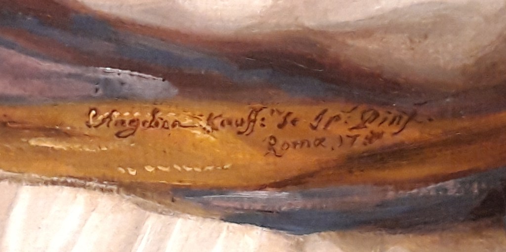
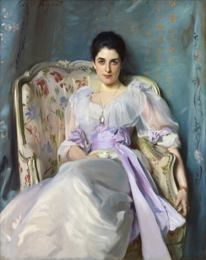
It seems highly unlikely, judging by what little I know about dogs, that Trump could read. Even if he could, it would surely only be the cleverest canine that would enjoy Shakespeare, Swift and Milton (specifically Paradise Lost), the very words written in gold lettering on the spines of the books. These clearly relate more to the owner than the owned, and appear to be the influences or inspirations that Hogarth is claiming for himself. Indeed, as the painting rests upon the books it would seem to suggest that they are the very foundations of his art.

Another way of looking at it is that his painting, sitting on top of Milton, Swift and Shakespeare as it does, represents the very apogee of artistic achievement. But why does he limit his own appearance to a painting, while showing us the ‘real’ Trump? Maybe he wants to say that he is his art – this is not just what he looks like, but his very essence, as if to say, ‘we are what we do’. The palette says the same, in a subtler and more sophisticated way. This is not, it would seem, the palette of a working artist – there is no paint on it (even though he included grey-scale daubs in an engraved version), nor are there any brushes (although technical analysis shows that at one point there were, stuck through the thumb hole of the palette). Instead there is an inscription: ‘The LINE of BEAUTY’, after which comes, in fainter script, ‘And GRACE’. Further to the right is his signature – or at least his initials – and the date, ‘W.H. 1745’.

This is as much the painting of a theoretician as of a practical painter. In 1753, eight years after the completion of this work, he would publish The Analysis of Beauty, a summation of his thoughts on art, expressed in essence by the Line of Beauty – the S-shaped curve we see on the palette. It implies not only a sense of flow in any depicted form, which he says is more interesting and varied than rigid, straight lines would be, but also gives a sense of liveliness and movement to a painting. It also, he believed, echoes the way in which our eyes look around an image.

As ever, things are never that simple. He was still formulating his ideas when this self portrait was completed in 1745, and painted out the words ‘And GRACE’ – only for them to be revealed again as the overpainting gradually became transparent. Even the line itself is not as simple as it may appear. An S-shape, yes, but one that casts a shadow on the palette. It is, in the world of the painting, a three-dimensional object, like a gold wire floating impossibly above the flat surface, resting with the lightest touch at either end. It is, in a way, a statement of the power of art to create things we do not know, or which can not exist within our physical world. In his book he would describe the line of beauty as being two dimensional, whereas the line of grace was three-dimensional – suggesting that this is the latter. However, it seems that he hadn’t settled on this distinction by the time the painting was completed, and so tried to cover ‘And GRACE’. This still leaves us with Trump. Why is he here? And why is he ‘more real’ than Hogarth himself, given that the artist is ‘relegated’ to a painted image?

X-ray analysis tells us that Hogarth had initially planned a more formal portrait to feature in this ‘Still Life’. In all probability it was more like the miniature by André Rouquet illustrated on the right. However, that formality – fully bewigged and dressed with cravat, waistcoat and jacket – was relaxed to show the artist in his cap and house coat, the way you would meet him ‘at home’, rather than dressed to the nines in performative fashion when out in Society. This is the man himself. And he was, of course, a man who loved dogs. He had a succession of pugs – Pugg, Trump and Crab are known by name, but Trump was the favourite, and gained the most renown. Apparently Hogarth often remarked how similar they were, and in this painting the proud pooch becomes an emblem of Hogarth’s pugnacious nature. The scar on the artist’s forehead, of which he was rather proud, might even imply that he (like Trump?) was a bit of a bruiser, although as it happens it was the result of an accident in his youth, rather than the trophy of a fight.

Trump himself became a well-known character. He probably appears in four other paintings, and nowadays he even has his own Wikipedia page, which will tell you what the paintings are. Not only that, but he was modelled in terracotta by the great French sculptor, and friend of Hogarth, Louis François Roubiliac – whose terracotta bust of the artist (which, like the miniature above, belongs to the National Portrait Gallery) I will talk about on Monday. Sadly the original Trump has been lost. Wedgwood made a version in black basalt ware based on a cast he got from a plaster shop owned by a man called Richard Parker. Neither the Wedgwood nor the plaster cast seem to have survived either: I certainly can’t track down any photographs. However, the Chelsea Porcelain Factory also released a white version, probably based on a similar, commercially available, plaster cast.  So here is Roubiliac’s Trump in a version by the Chelsea Porcelain Factory, now in the V&A. That’s what I call celebrity.

When I first posted this, the painting was included in the Tate Britain exhibition Hogarth and Europe, which led me to question how our painting related to the rest of the continent. Presenting the artist as a typical British Bulldog (or rather, Pug), and resting on three of the great British authors, there wouldn’t seem to be anything ‘European’ about it, until you realise that The Line of Beauty – that sinuous S-shaped curve – is, in itself, one of the founding compositional principals of Rococo art and design. As so often, Hogarth may have expressed disdain for everything ‘overseas’, but he was a great lover of its art. But was that even what Tate Britain’s exhibition was about? You’d have to look up my review in the Burlington Magazine to find out (and sorry, you’d have to pay for it on that link, but you could look it up in a library).

It’s possible that Trump – or more likely, Crab – originally made an appearance in the NPG self portrait. However, the featured dog was painted out, probably because he had adopted a rather disrespectful stance, as dogs regularly do. I’ll see if I can find an X-ray to show you where he was – and what he was doing – in time for the talk on Monday.