
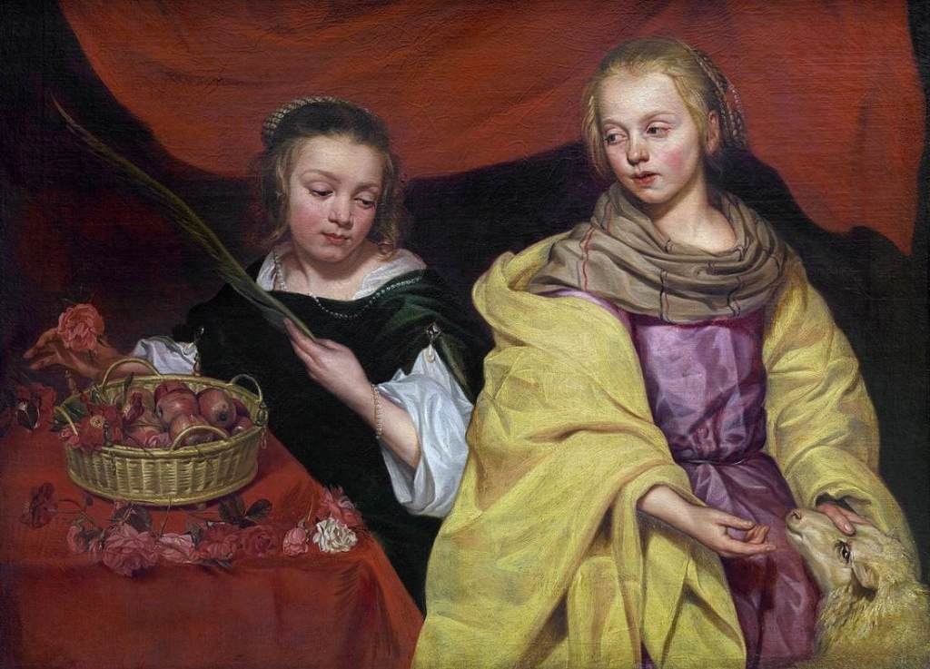
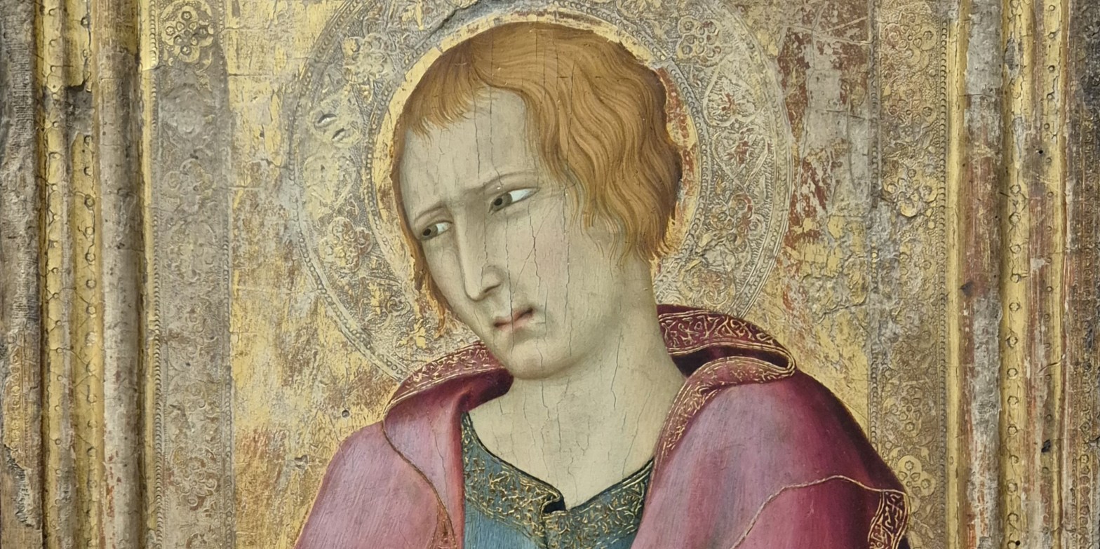
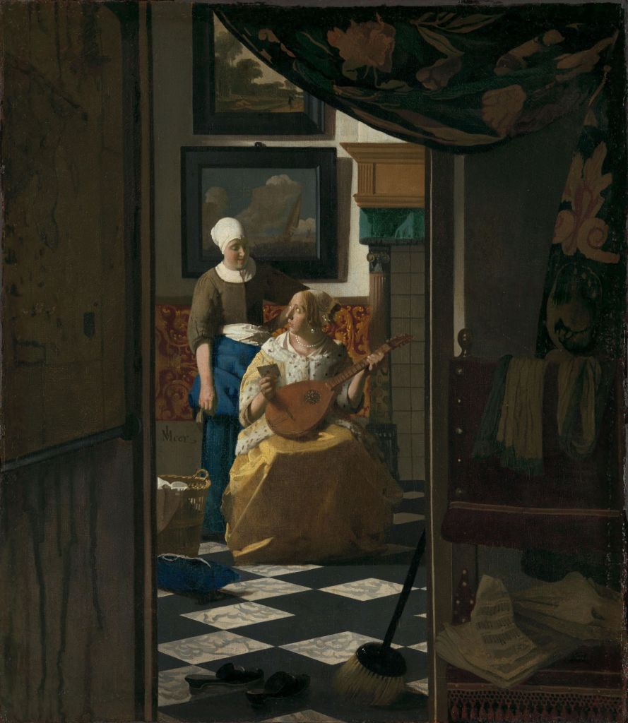
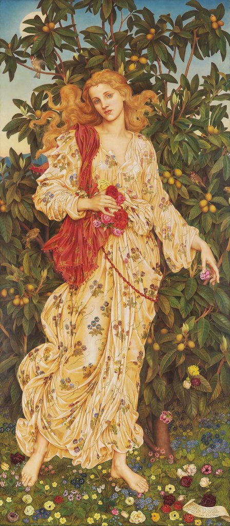
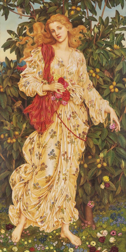
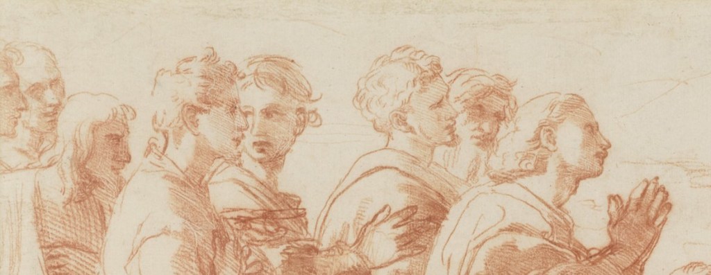
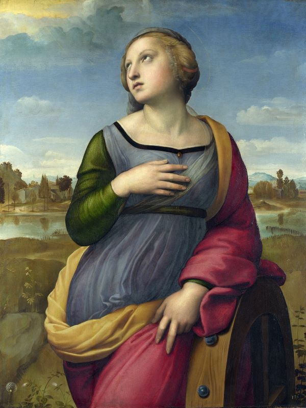
Michaelina Wautier, Two Girls as Saints Agnes and Dorothy, c. 1655. Royal Museum of Fine Arts Antwerp.
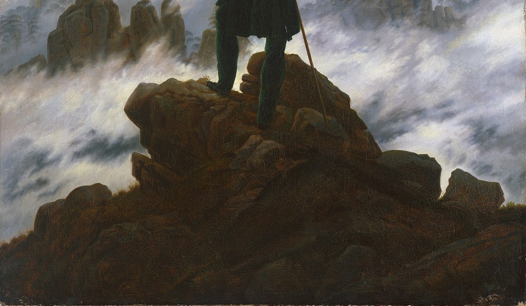
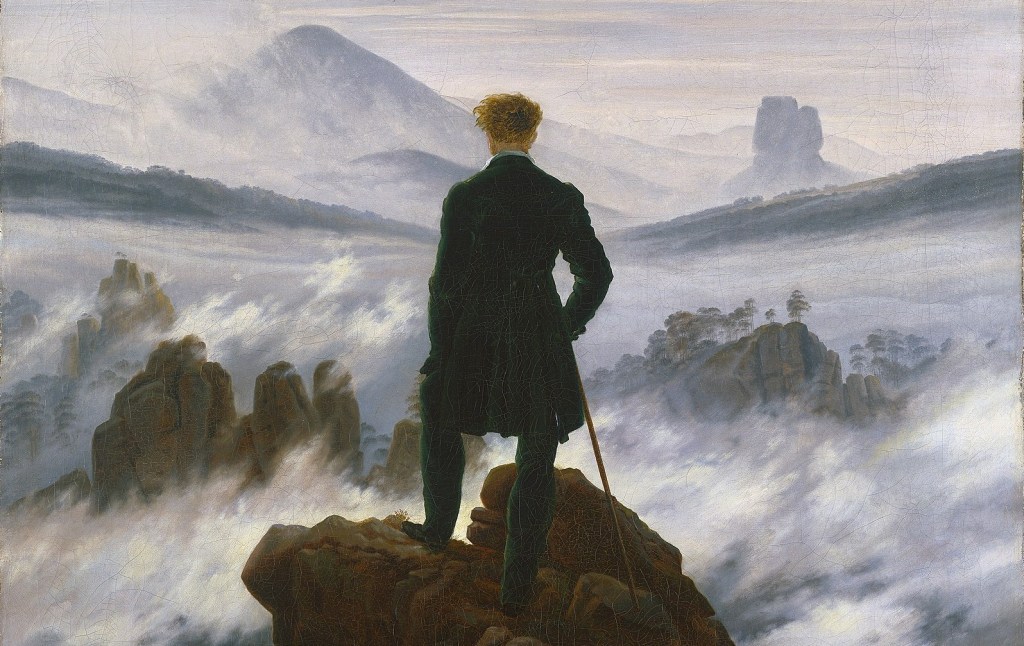
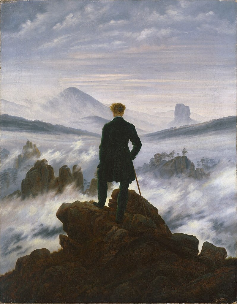
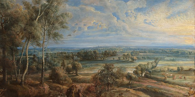
Greetings from Vienna! I’ve just got back to my hotel having seen Canaletto & Bellotto – it’s superb, but more of that later. I also bumped into one of you first thing, which was delightful, if confusing (I wasn’t really awake)! The exhibition Michaelina Wautier, about whom I will be talking this Monday, 30 March at 6pm, was here in Vienna just a few weeks ago, but opens this week at the Royal Academy in London. Michaelina herself has taken a little longer to come out of the shadows than some of her contemporaries, women who were every bit as skilled as their male colleagues. I first saw her work in the exhibition Ingenious Women in Hamburg a couple of years ago, and so was delighted when I learnt that the Kunsthistorisches Museum in Vienna would be staging an exhibition dedicated to her. And yes, I was even happier when I heard that it would come to the RA. Sadly not everything has travelled from Vienna – today’s painting, for example, is already in an exhibition in Ghent for example… but that makes it all the more worthwhile to look at it today. My current trip, to see Canaletto & Bellotto, will be the subject of the following talk, on Monday, 20 April (in between I’ll be on holiday…). To follow that I will talk about a slightly more recherché, but entirely delightful, exhibition looking at female landscape artists. It is my third visit to The Courtauld this year, this time to see their exhibition A View of One’s Own. None of the women exhibited are ‘famous’ – but they were all undoubtedly experts in their field, and this focussed exhibition is definitely worth a visit in its own right. I will take a close look at it on 27 April. More will follow, and any news will eventually appear on the diary.
If you do book any of these events, Tixoom will send an email with the ticket – effectively a link to the talk – within seconds. If it doesn’t arrive within 24 hours, do let me know and I’ll try and sort it out: it would be easier to do when there’s time to spare than 5 minutes before the talk! Of course, it could be in your spam folder (that happened to someone just last week). You should then get reminders 24 hours and 15 minutes before the talk, and these will also include the link.
This year’s trips with Artemisia are rapidly filling up – both Siena trips are full, as is Liverpool – but there are still a few places left if you would like to come to Strasbourg and Colmar from 5-8 June. Both locations are remarkably picturesque, and have fantastic food – and in June the weather will be great, ideal for a boat trip around Colmar’s ‘Little Venice’ – oh, and there’s truly fantastic art too! This includes Grünewald’s Isenheim Altarpiece (in Colmar) – an astonishing painting that truly is one of those important works you really should see – and one of France’s most fantastic Gothic cathedrals (in Strasbourg) – for over two centuries the tallest building in the world, and still the tallest medieval structure to survive! And then there’s the history… but don’t let me get carried away: just click on the link above and book!

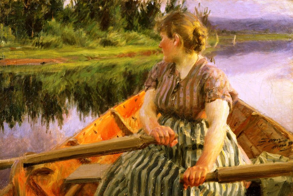
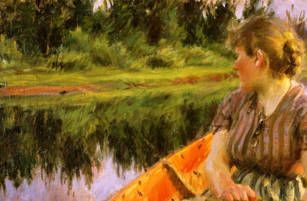
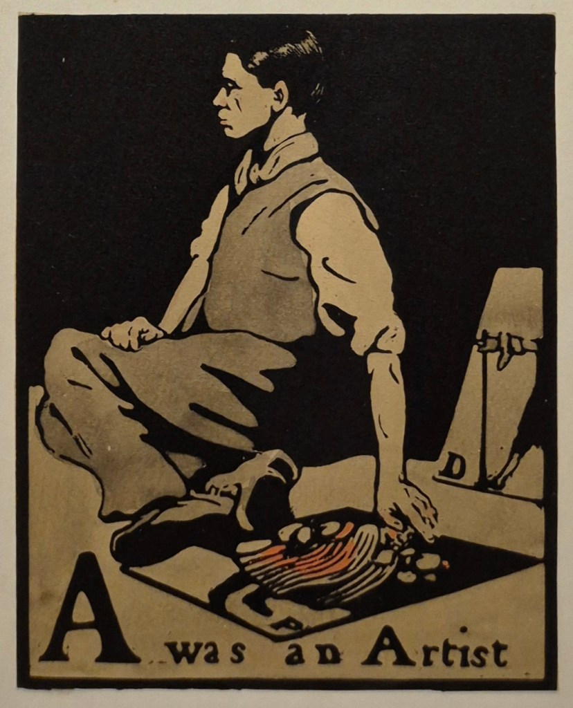
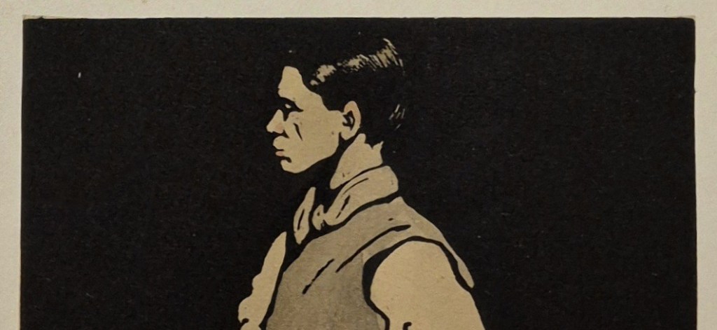
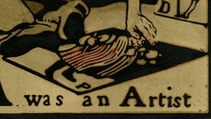
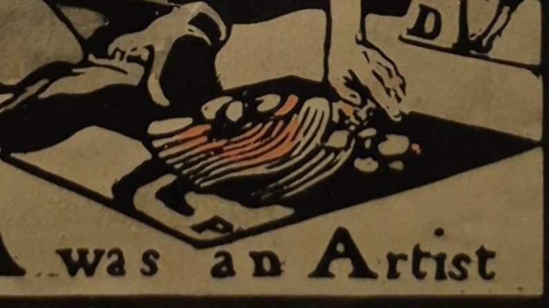
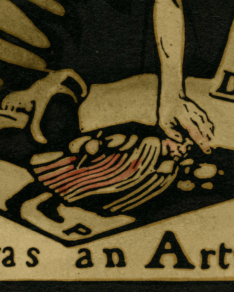
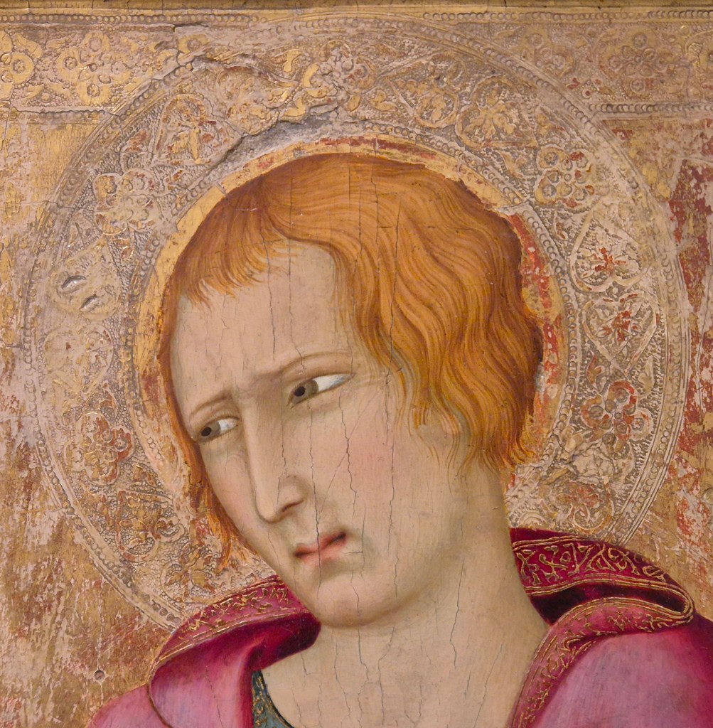
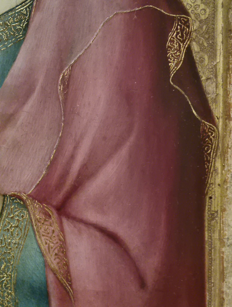
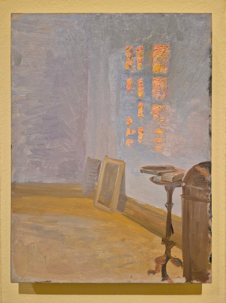
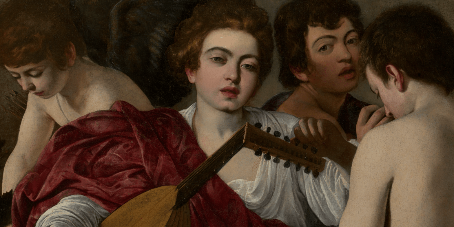
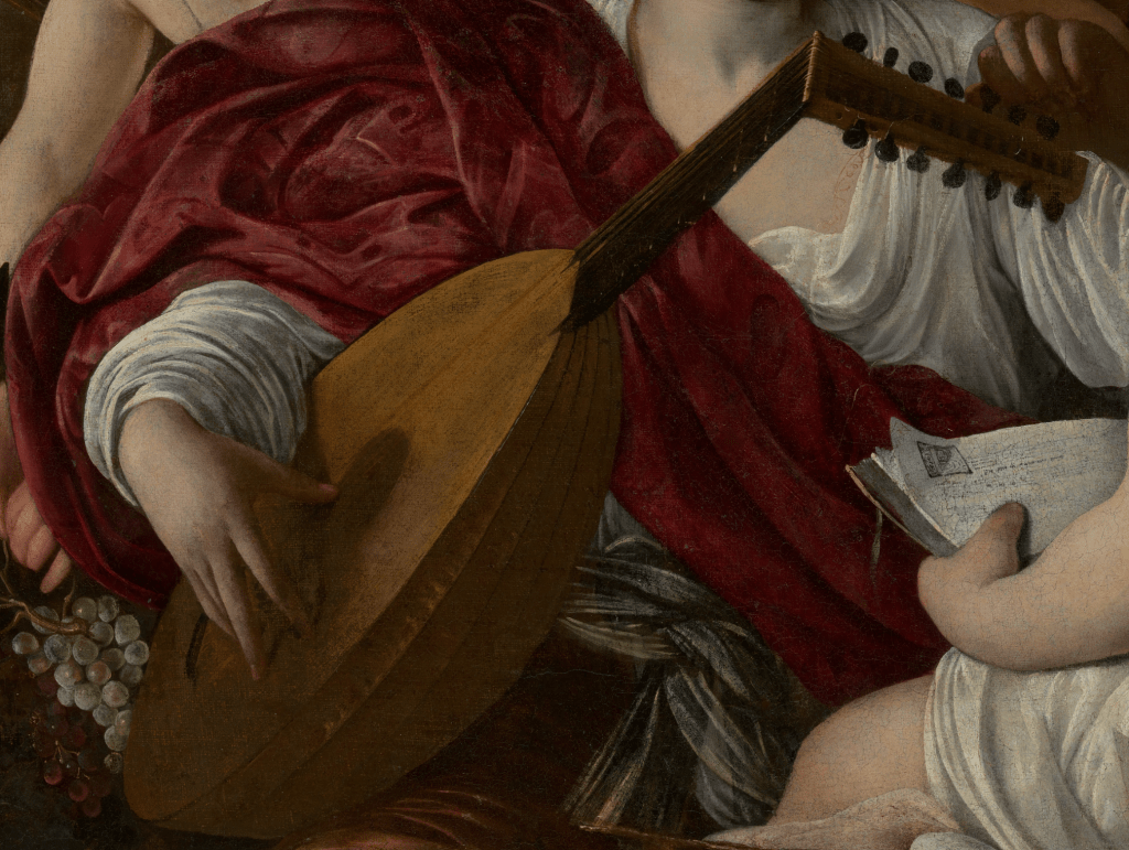
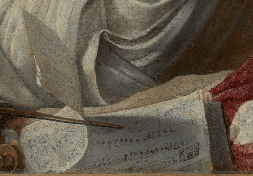
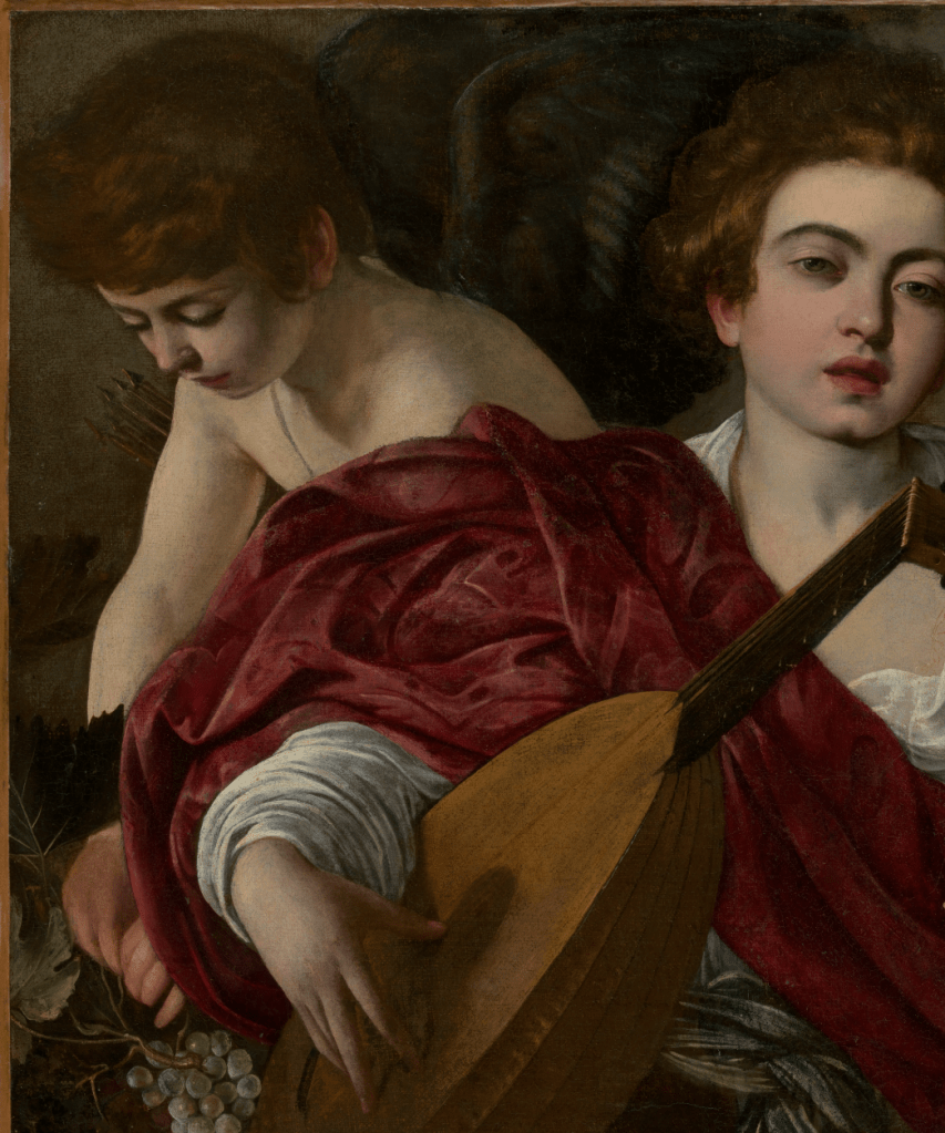
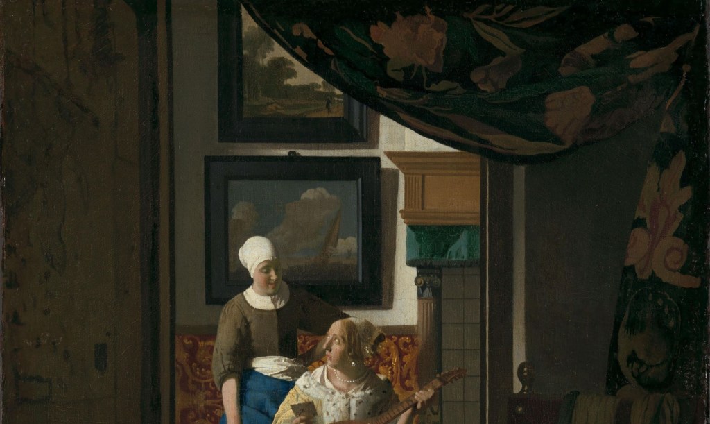
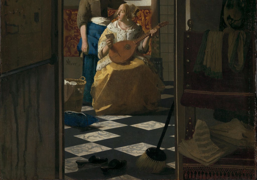
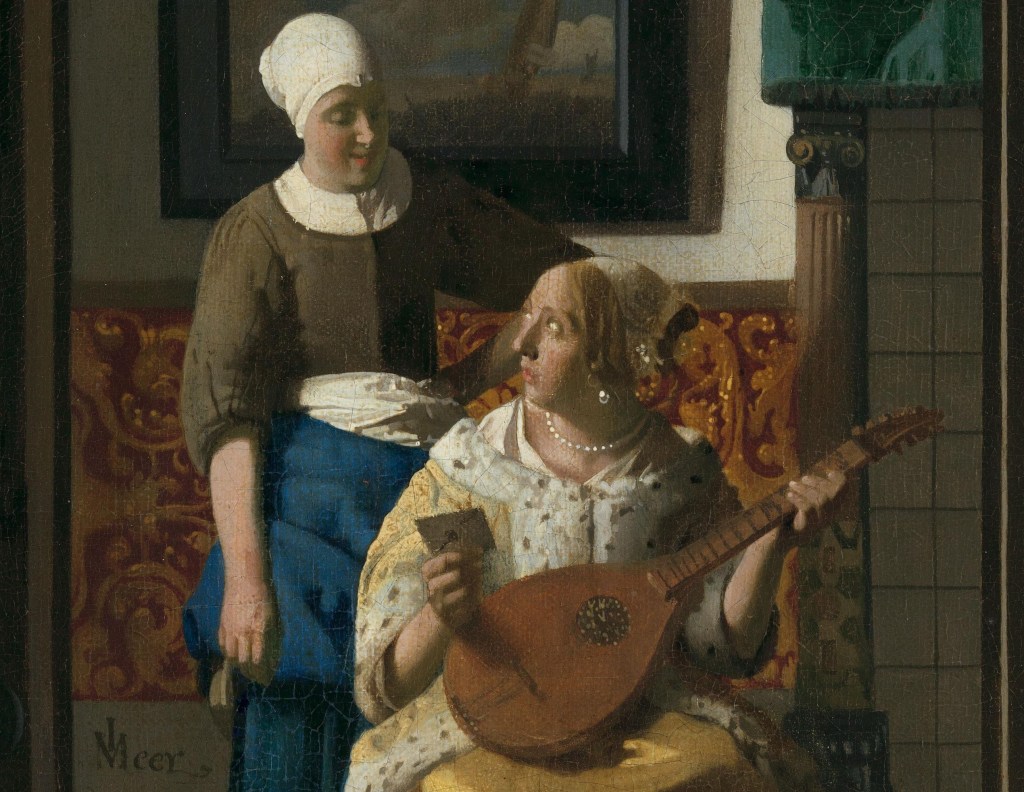
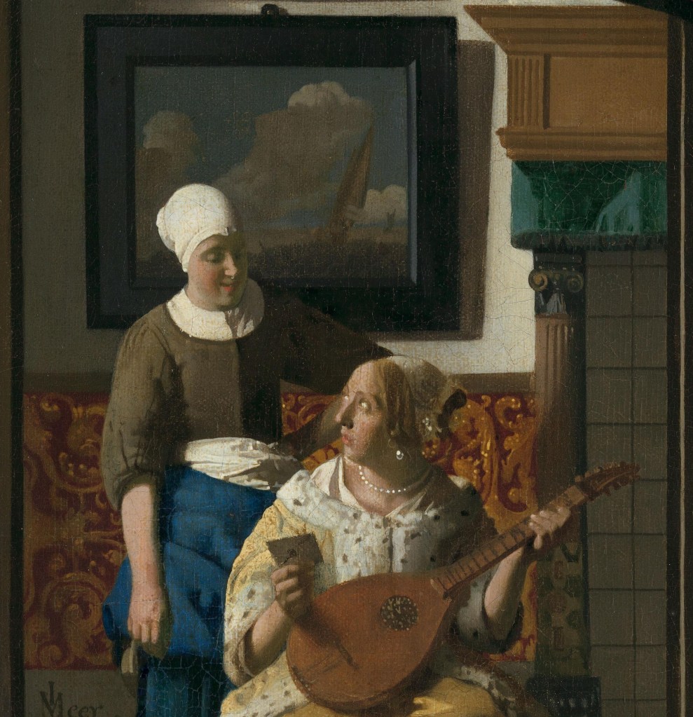
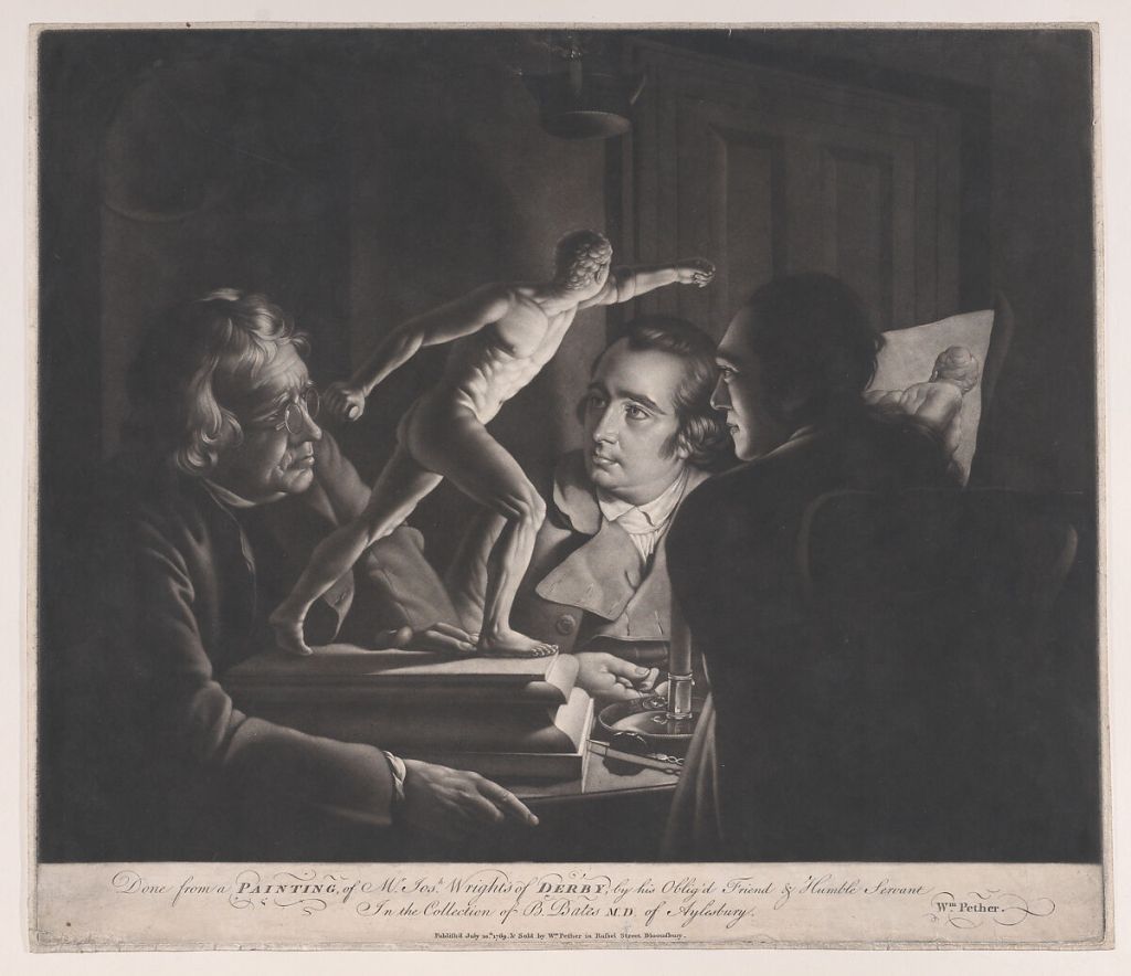
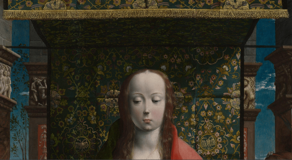
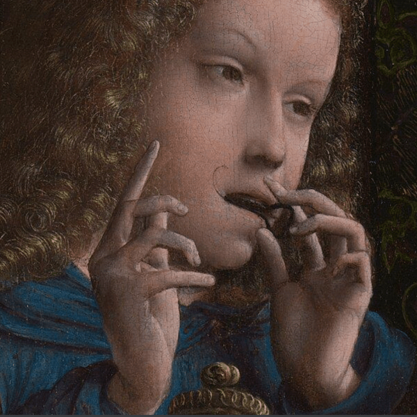
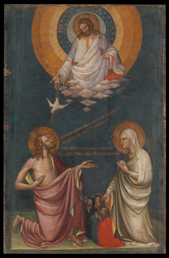
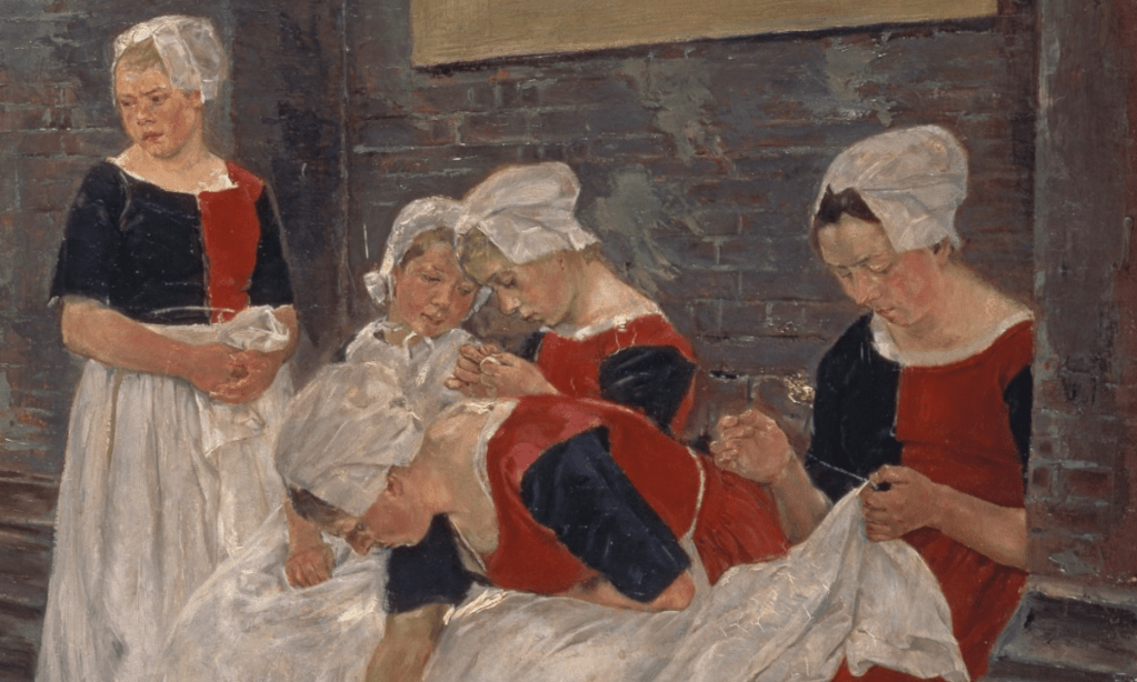
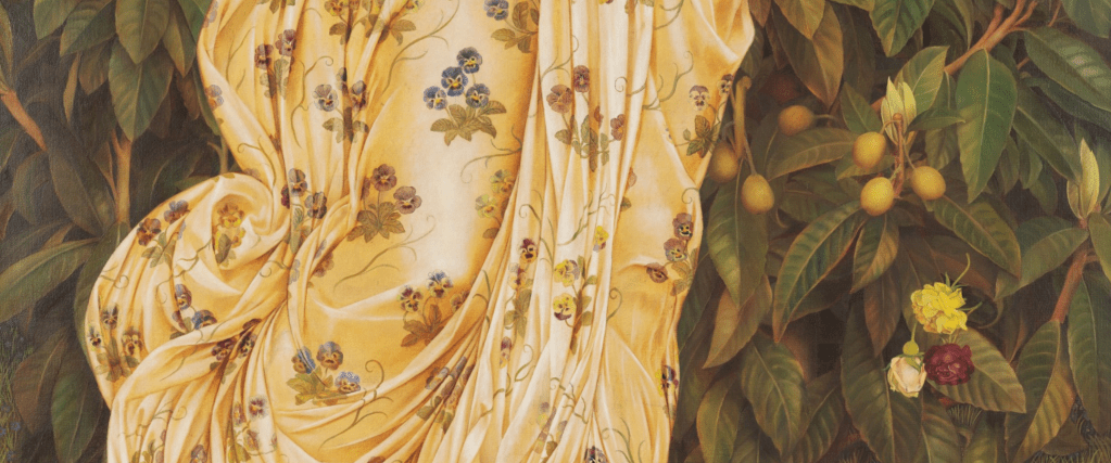
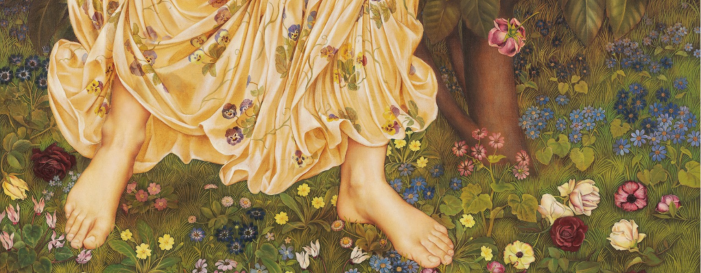
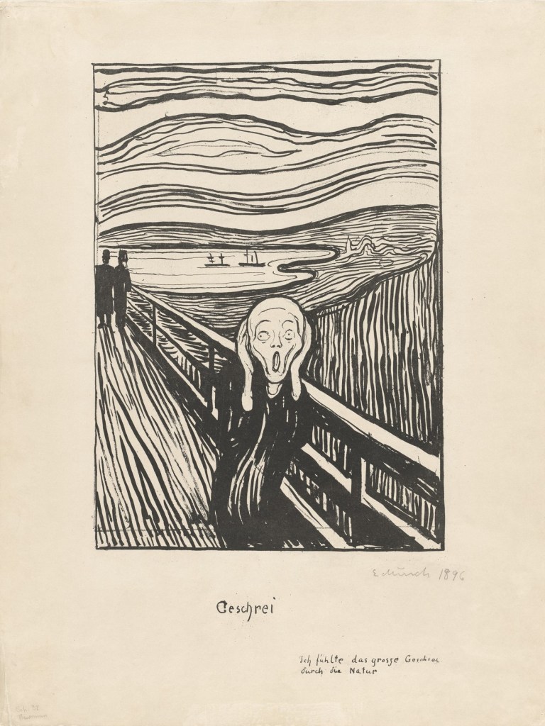
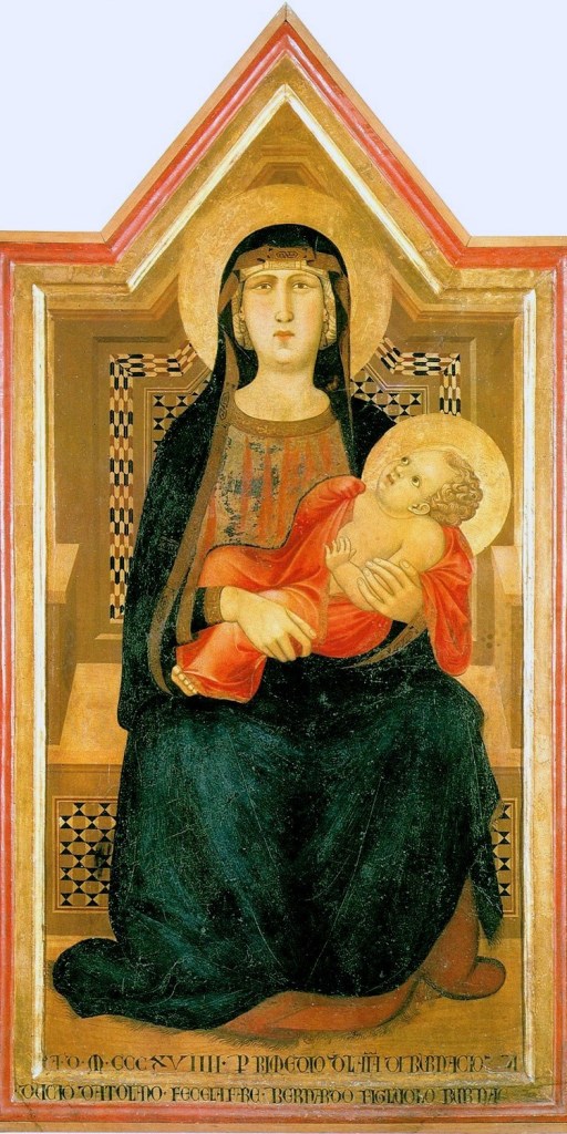
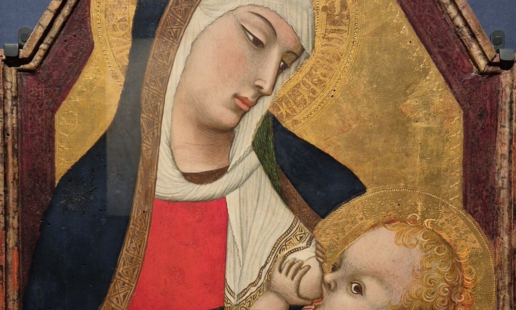
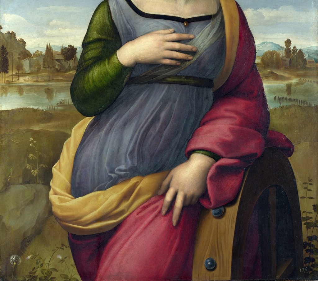
Two girls are standing in a darkened room which is enlivened by a swathe of vermillion cloth hanging behind their heads. There is nothing to indicate where they are though, but there is a table covered with a similarly coloured fabric in the front left corner, on which a basket of apples is surrounded by scattered roses. The two girls are of different heights, and so may be of different ages, although this is by no means certain. The most prominent stands on the right: not only is she taller, but she wears brighter colours – a rose-pink dress, and a voluminous daffodil-yellow cloak. She also has a striped scarf, or shawl, around her neck. She looks out of the corners of her eyes in the direction of the other girl – although it is by no means clear that she is actually looking at her. She indicates a sheep, or lamb, with her right hand, while holding its head with her left. She stands further forward than the other girl, and her cloak falls in front of the table cloth – so our view of her is clear all the way to the bottom of the painting. By contrast, the other girl is shorter, stands behind the table, and so is further back than the taller girl – all compositional motifs which make her less prominent (and therefore, in some way, less important). In addition to this she wears a dark green dress which merges with the dark background, again making her appearance less striking. However, this dress has sleeves which are slashed from the shoulders, allowing us to see not only the billowing sleeves of her white chemise, but also her hands and more or less of her forearms. In her right hand she is holding a rose, whereas in her left there is a long, undulating green form which continues the diagonal of her forearm. This is a palm of martyrdom, which helps us to understand what is going on. These two girls are dressed as saints – but they have no haloes to confirm their sanctity.

Not all artists paint haloes, though – often our understanding of the subject matter and the identification of the characters represented relies on context. It becomes obvious, due to the sense of a narrative, or the other figures represented, that we are looking at a specific type of person – but that is not the case here. However, it would seem unlikely that a girl who is so finely dressed – even though her clothing doesn’t seem to refer to any specific historical or geographical style – would have a sheep as a pet. Not only is this animal not in a field or farm, but it is indoors, suggesting that it must be there for a very specific reason. It is, indeed, a symbol. The saint most commonly associated with a sheep, or lamb, is of course John the Baptist, who greets Jesus just before his baptism with the words ‘Behold the lamb of god, which taketh away the sins of the world’ (John 1:29 in the King James version). However, this is not John – no camel skin, and definitely a girl. But if we quote the Vulgate, the same verse would be ‘Ecce agnus Dei…’. The Latin for ‘lamb’ is ‘agnus’, which suggests that this girl is dressed as Saint Agnes. While this linguistic similarity might seem ‘obvious’, it isn’t, necessarily. Rather than her name, the appearance of the lamb can be connected to a vision – it’s probably a combination of the two. Most artists – indeed anyone who could read – would have known the Golden Legend (to which I have regularly referred), a collection of the lives of the saints put together by the Dominican friar Jacobus de Voragine in the 1260s. He started every ‘Life’ with a discussion of the meaning of the saint’s name – a form of etymology. I am quoting from the first English translation, by William Caxton, which was published in 1483, and this is what he says about Saint Agnes:
And next followeth of S. Agnes, and first the interpretation of her name.
Agnes is said of agna a lamb, for she was humble and debonair as a lamb, or of agnos in Greek, which is to say debonair and piteous, for she was debonair and merciful. Or Agnes of agnoscendo, for she knew the way of truth…
You can find the full ‘Life’ on this link, but a couple of details from it might be helpful. Agnes’s martyrdom involved being stripped naked and led to a brothel (they didn’t want to kill a virgin) – but no one could approach her, and she made the best, even of this situation.
Then made she of the bordel her oratory, and in making her prayers to God she saw tofore her a white vesture, and anon therewith she clad her and said: I thank thee Jesu Christ which accountest me with thy virgins and hast sent me this vesture.
Curiously – to my mind – the website of the Royal Museum of Fine Arts in Antwerp, which owns this painting, says that this ‘vesture’ is shown in the painting, or rather, ‘She is wearing a loose yellow cloak that is also mentioned in the Legenda aurea [Golden Legend]’. It could be that there are different translations, but I can’t think why a virginal white would appear anywhere as yellow. However, they might be referring to another section of the Life. Agnes’s foster sister Emerentiana was also martyred, and buried alongside her, and,
…when the friends of S. Agnes watched at her sepulchre on a night, they saw a great multitude of virgins clad in vestments of gold and silver, and a great light shone tofore them, and on the right side was a lamb more white than snow, and saw also S. Agnes among the virgins.
Maybe in this painting ‘Agnes’ is wearing one of the ‘vestments of gold’ – and also standing, without doubt, next to the lamb.
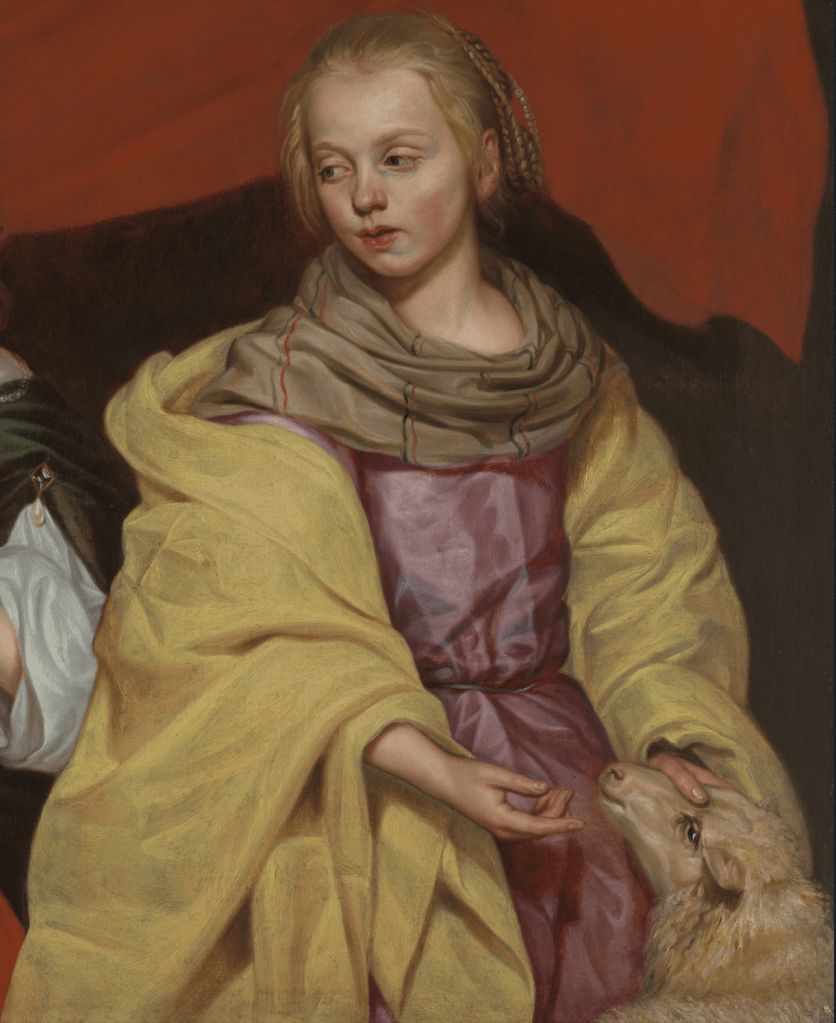
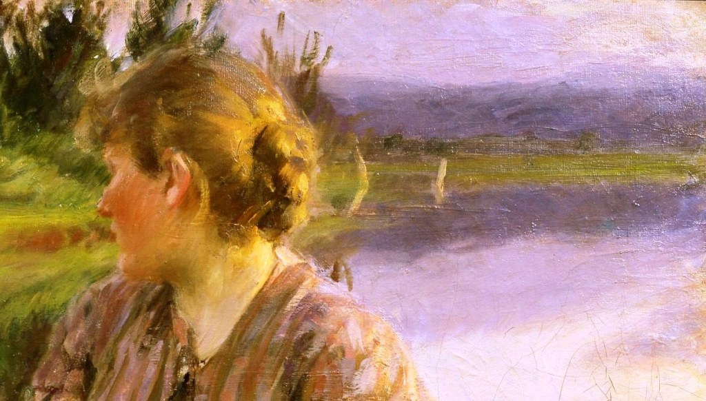
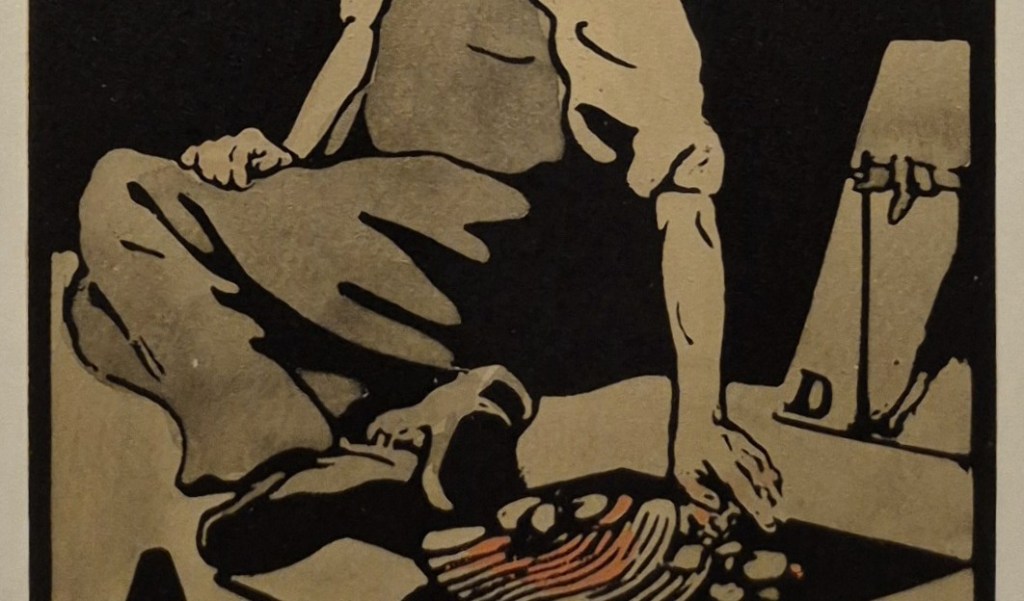
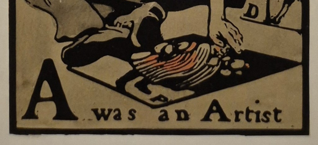
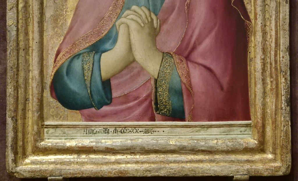
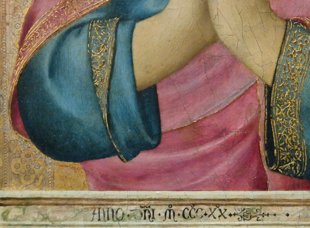
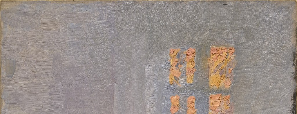
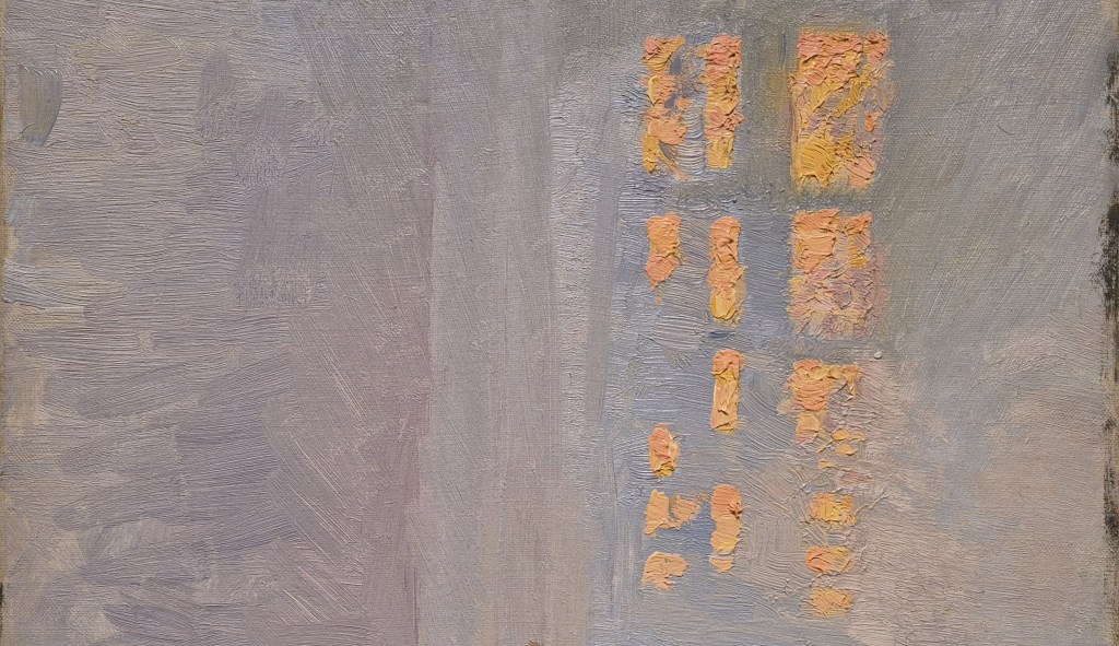
As part of the composition, the figure of ‘Agnes’ forms a narrow pyramid, or a tall, slim, isosceles triangle. Its outline leads up from the lamb in the bottom right corner to her head, and then down to the left of centre, just in front of the table. The yellow cloak falls off her right shoulder (on our left), revealing a sliver of the pink dress, and curving round the striped shawl. The red cloth hanging behind her head echoes the curve of her shoulders, rising on a shallow diagonal from our left, and then curving down to the right, with an undulating hem leading to a sharp corner.
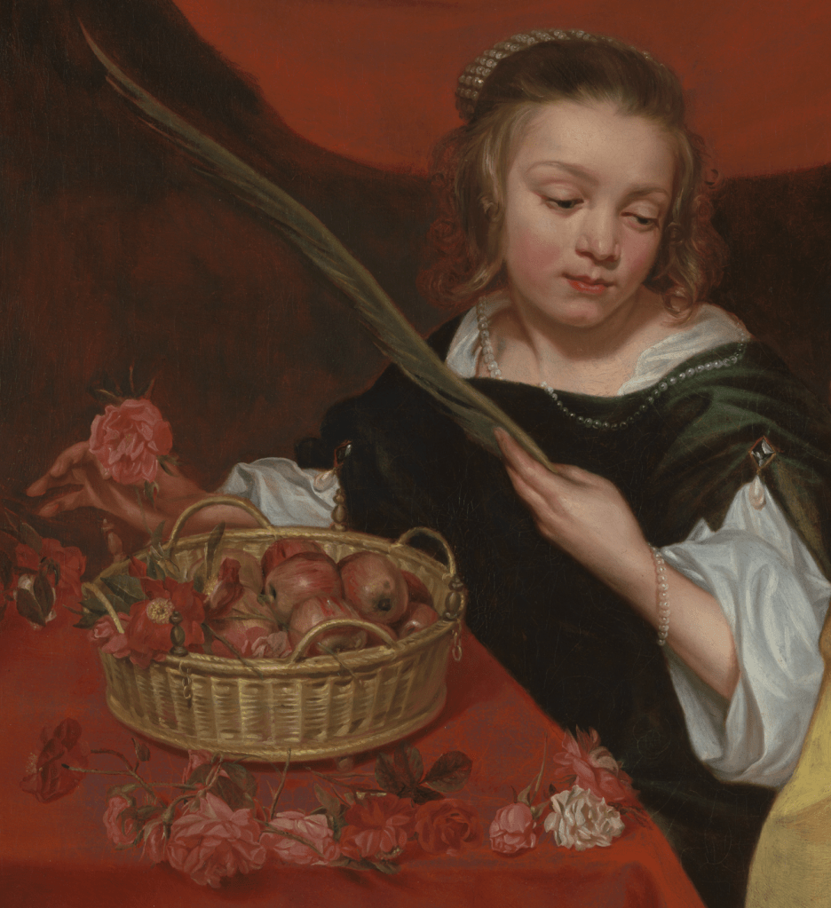
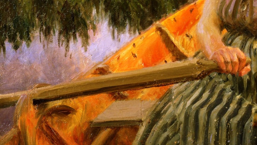
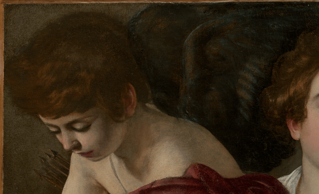
Rather than looking towards the taller girl, this figure looks down to the right – towards the lamb – and her gaze parallels the diagonal of the palm. It was this palm which alerted us to the fact that these girls represent two saints. Her hair is held back by a band sewn with many pearls, and she also has strings of pearls around her wrist and neck. Not only that, but the slashed sleeves of her dress are pinned up by brooches hung with a large drop pearls. With so many pearls, we might guess that this is Saint Margaret – as ‘margarita’ is Latin for ‘pearl’ (the Greek word is similar) – but she is not. There’s no dragon, for one thing. The roses and apples tell us she is St Dorothy. If I’m honest, I knew about the flowers – but clearly hadn’t read her Life in enough detail to realise that they were specifically roses – and I don’t remember seeing the apples in any other image: however, they should be there. Again, I am quoting from the version ‘Englished by William Caxton’, as it says in the first edition of 1483, which you can find via this link. Like St Agnes, St Dorothy saw herself as the bride of Christ – as Nuns do to this day – and so He is the spouse referred to here. She was condemned to death by beheading,
… and as she was led to the place assigned where it should be done, a scribe of the realm, named Theophilus, said to her in scorn: I pray thee to send me some of thy roses and apples that thou hast gathered in the garden of thy spouse that thou praisest so much, and she granted to him his desire. And this was in the cold winter time when there was both frost and snow.
…
And this holy virgin bowed down her head, and the cruel tyrant smote it off.
But a little before this, appeared before her a fair child barefoot, clothed in purple, with crisp hairs, whose garment was set full of bright stars, bearing in his hand a little basket shining as gold, with roses and apples, to whom the virgin said: I pray thee, bear this basket to Theophilus the scribe.
…
And as this said Theophilus stood in the palace of the emperor, this child came to him and presented to him the basket, saying: These be the roses and apples that my sister Dorothy hath sent to thee from Paradise, the garden of her spouse, and then this child vanished away. Then he, considering the marvellous work of God in this holy virgin, said anon with a stern voice, praising the God of Dorothy for that great miracle which was showed to him of roses and apples that time, that he that sent to me these things is of great power, and therefore his name be blessed world without end, Amen. And then he was converted to the faith of Jesu Christ, and the most part of the people of the city.
The ‘fair child’ who delivered the basket is often identified as the Christ Child himself, and is occasionally treated as one of St Dorothy’s attributes. A good example is the painting by Francesco di Giorgio in the National Gallery, Saint Dorothy and the Infant Christ, in which it is the Christ Child who is carrying the basket. It only contains flowers – too small, and indistinct to identify – but definitely no fruit – which could explain my ignorance about the apples.
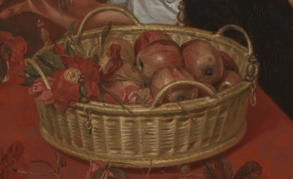
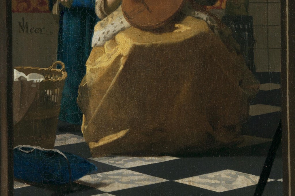
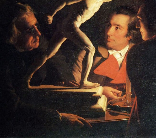
For Michaelina Wautier, as for so many, the basket is enough to identify Saint Dorothy, and not only that – it is beautifully painted. The apples are some of the best I remember seeing, with a delicacy and subtlety of painting that is unparalleled. Fine strokes of red and green paint are delicately interwoven, and only interrupted by a soft sheen of white, where the light reflects off the surface. The form of each fruit, curving round at the end to the dark dimple containing the remains of the blossom, is perfectly realised. However, even if these are heavenly apples – delivered by the infant form of Dorothy’s devotional ‘spouse’ – one of them, on the right of the basket, has a small bruise: it is real, not idealised. I suspect that the roses are Rosa gallica, the Gallic or French rose, the first to be cultivated by the Greeks and Romans, but I’m not an expert (and the Ecologist is in Kenya). However, they are a deep red – and dog roses (Rosa canina) are usually a very pale pink. The photos of Rosa gallica that I’ve seen are not this dark either: the rich colouration could either relate to their heavenly origin, or to the fact that this is a 17th century painting, by which time the cultivation of roses was resulting in a wider range of colours. The basket itself is also rather beautifully painted, and, in terms of baskets, a rather fine example. There are four curving handles, below which the basket is supported by four spherical feet (admittedly only one is visible, but I am extrapolating). In between the handles are wooden finials carved a little like chess pieces, below which hang short chains with three links each – presumably these are purely decorative details. The weaving of the basket itself is meticulously painted, with slight gaps between the weave towards the top and bottom, and stronger rings framing the splayed sides at its rim and base. Michaelina Wautier did paint a couple of Still Lifes which survive – but then, she worked in all genres, one of the features of her work which the curators of the RA exhibition deem remarkable (and yet, I can’t help thinking that most women who painted worked in more than one genre anyway).
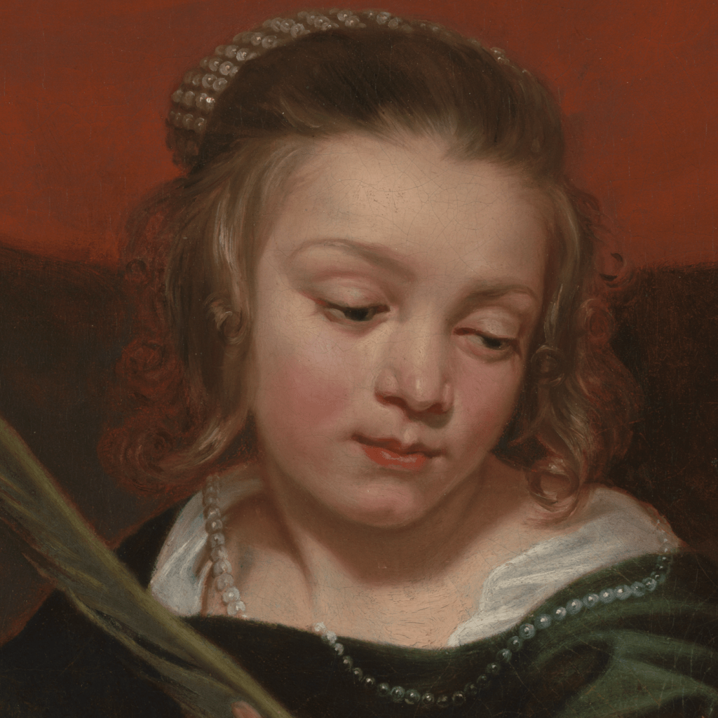
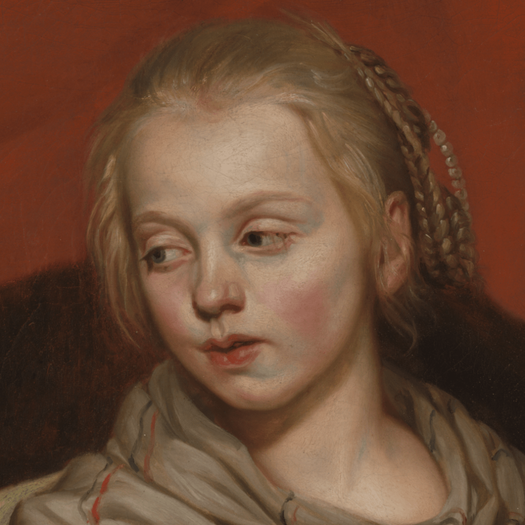
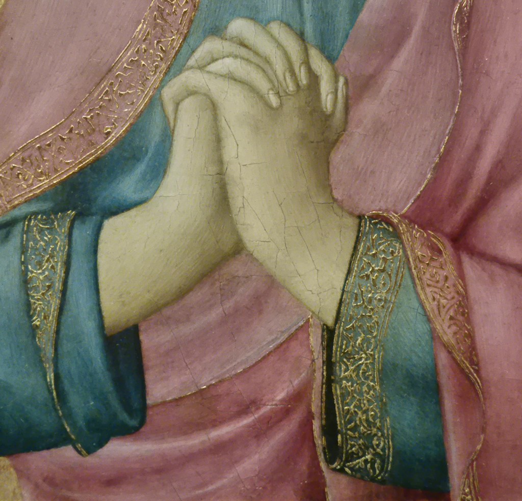
The specificity of the faces has led people to believe that this is a double portrait, of a type known as a portrait istorié – in which the subjects are dressed as figures from myth or religion. This explains the ‘as’ in the title of the painting, Two Girls as Saints Agnes and Dorothy. The similarity of the features suggests that they are two sisters. Notice especially the cupid’s bow mouths, the noses with a round, bulbous ends which rise from curving, slightly depressed bridges, and the hint of dimples in the chins. It’s always tricky to make these assertions, though, as what you are looking at, as much as anything, is the artist’s style. Michaelina tended to paint a long, vague highlight along the bridge of the nose, with a separate, irregular highlight at its tip, for example. She painted the softest of lips, and the most delicate hair, lustrous, and combed back from the irregular hairline, where the scalp is revealed in between some of the parted hairs. The girls are so refined that their skin is luminous, and with the elder sister in particular – who I take to be ‘Saint Agnes’ – it appears translucent, with the blood vessels visible beneath. While ‘Dorothy’ looks down to the lamb, ‘Agnes’ looks towards her sister, her mouth slightly open. In both cases the red cloth passes behind the head at eye level.
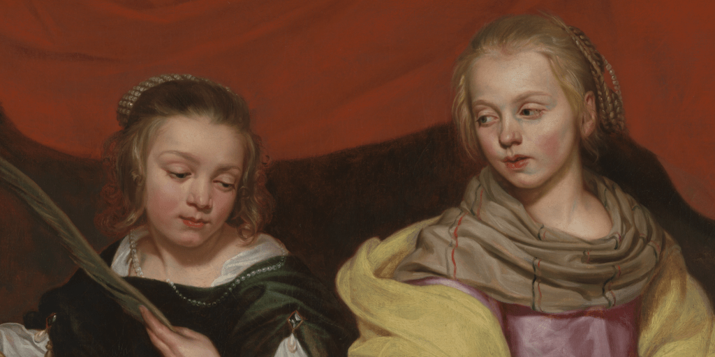
When see together, it is clear how the red cloth links the two girls and directs our attention towards the directions of their gaze. ‘Dorothy’ appears deferential, while ‘Agnes’ is concerned for her younger sister – or for the fate of Saint Dorothy – or both. We can only hypothesise why they are dressed as these two saints, as we have no idea who they are (there is a suggestion, but it seems to be without foundation). In the 18th century Joshua Reynolds painted portraits historiés to try and raise the status of portraiture: he would far rather have been painting ‘history paintings’. Earlier generations though, especially in cases like this, sometimes used them to stress the sanctity of the sitters. The subjects here would have been the daughters of a wealthy Catholic family in Brussels – where Michaelina shared a studio and lived with her brother Charles – and this portrait may have been painted either because the parents were inordinately proud of their daughters, or because they wanted to demonstrate their eligibility for marriage: wealthy, beautiful, modest, saintly and virginal. Whatever the reason I am only too glad to enjoy the delicacy of depiction, the mastery of form and composition and the rich use of colour, not to mention the evocation of character, and the subtlety with which the identities of the Saints is presented.
The girls may be dressing up and playing make believe, but another reason why they are dressing up is to make us believe in these two saints and in the virtue of their lives. It is the great power of painting to make us believe. After all, when looking at this image there really are no sisters, no saints, no flowers or apples, not even a lamb: there is only paint. And yet, as we will see on Monday, Michaelina Wautier can make us believe that these things were there, that she saw them, and she painted them. And how well she painted them too! I think I’ll have to go to the exhibition in Ghent to see this painting in the flesh…


